What's new
Shipping continuously
The latest releases — see the full history in the in-app changelog.
v2.291.0–v2.295.0 — Five more User-manual topics deepened and corrected against the shipping codeJune 17, 2026 · 09:30 UTC
The in-app User manual keeps closing the gap between what the app does and what it documents — this run deepening four core topics and correcting one. New and rewritten topics cover the built-in sample datasets — naming the three shipped samples, their columns and that they are generated locally, replacing stale references (v2.291); heatmaps, properly explained — the measure and aggregation, the Top-N-columns control, the draggable colour scale, the hottest/coolest caption, the coverage note and click-to-drill (v2.292); selecting and marking in charts — plain versus additive clicks, the rubber-band box-select and where it works, stacked elements marking two values, and dashboard highlighting (v2.293); filter types — how the right control is picked per column automatically, the is/is-not and contains/does-not-contain switches, blank handling and the tick-list helpers (v2.294); and a correction to column types — there is no import “confirm the types” step (Tablumo reads each column from its values and opens the table straight away), a column’s type is inferred from its data rather than set from a menu, and currency and percent are display formats applied to a number column, not separate types (v2.295). Documentation only — every topic was checked against the shipping code before it was written.
v2.286.0–v2.290.0 — Five more shipped capabilities get a clear, accurate User-manual topic of their ownJune 17, 2026 · 09:05 UTC
The in-app User manual keeps closing the gap between what the app does and what it documents — this run deepening five core grid-and-filter topics against the shipping code. New and rewritten topics cover dragging columns into a new order — grab a header and drop it, with the dragged header fading, a leading-edge drop bar showing where it lands, hidden columns skipped, and the order saved with your analysis (v2.286); the column header menu — all four ways to open it (the ⋯ button, right-click, long-press and the keyboard) and an accurate, complete list of what it offers, replacing an old vague entry (v2.287); filter chips, properly explained — the live row count, click-to-edit, the ✕ and Clear-all, the right-click drill-down into kept or removed rows, and the per-pair AND/OR connectors (v2.288); resizing and auto-fitting columns — the right-edge drag handle with live reflow and clamped width, double-click to auto-fit a column to its content, and that widths save with the analysis (v2.289); and how filters combine — AND by default, flipping any gap to OR with the connector button, and the “Logic…” editor for custom expressions like 1 AND (2 OR 3) (v2.290). Documentation only — every topic was checked against the shipping code before it was written.
v2.281.0–v2.285.0 — Five more shipped features get a plain-words User-manual topic of their ownJune 17, 2026 · 08:20 UTC
The in-app User manual keeps closing the gap between what the app does and what it documents. New and deepened topics cover reference lines, goals and bands — the Average / Median / Min / Max lines, the ±standard-deviation band, a goal line and a target band you can lay over a chart (v2.281); right-clicking a bar, slice or point — the chart data-point menu headed by the value you pointed at, with Filter to / Exclude / View these rows / Export PNG, and how it adapts for histogram bins, heatmap cells and bucketed dates (v2.282); light, dark and auto theme — the sidebar theme switch and its Dark → Light → Auto cycle that follows your device and re-colours charts live (v2.283); sending feedback and ideas — the in-app feedback form, its two entry points and the screen context it can attach (never your cell values) (v2.284); and multi-column sort — shift-clicking headers to stack sort columns, the superscript priority numbers, flipping or removing one column, and the plain-words direction wording (v2.285). Documentation only — every topic was checked against the shipping code before it was written.
v2.276.0–v2.280.0 — Five more shipped features get a plain-words User-manual topic of their ownJune 17, 2026 · 07:55 UTC
The in-app User manual keeps closing the gap between what the app does and what it documents. New topics cover displaying dates by month, quarter or year — the grid date-column header menu that rolls timestamps up into readable periods (v2.276); renaming a dataset — the sidebar’s right-click Rename, a purely cosmetic relabel that leaves SQL, calculated columns and combined tables working (v2.277); turning a chart selection into a filter — promoting a scatter box (“Filter to this box”) or a histogram sweep (“Filter to this range”) into a persistent, app-wide filter rather than a momentary highlight (v2.278); filtering or excluding a value straight from the grid — the right-click cell actions that build an ordinary global filter by pointing at an example, with keep-only versus accumulating-exclude, blank-cell handling, and whole-period filtering on bucketed dates (v2.279); and turning a scatter box into a table tile — the “Show boxed rows as a table” action that spins a brushed cluster of points into its own sortable, exportable table beside the chart (v2.280). Documentation only — every topic was checked against the shipping code before it was written.
v2.271.0–v2.275.0 — Five more shipped features get a plain-words User-manual topic of their ownJune 17, 2026 · 07:30 UTC
The in-app User manual keeps rounding out, documenting capabilities that already worked but had no reference of their own. New topics cover resizing columns to fit — dragging a column edge to any width and double-clicking it to auto-fit the content (v2.271); the Columns picker — the checklist behind the “Columns” button, with a name/type search box, type chips, and one-click “show only these” / “hide these” on wide tables (v2.272); number, currency and percent formats — the display-only per-column format menus, currency by symbol/name/code or from a column, percent as a ratio or as-is, compact shorthand, and the one-click “apply to all number columns” (v2.273); the totals footer — the running total pinned under every number column and its right-click “Summarize by” menu of averages, medians, percentiles and more, always computed honestly over the rows in view (v2.274); and copying values, rows and column names — the right-click Copy value, Copy row as TSV or JSON, and Copy column name / Copy all column names actions, which follow whatever the grid is showing (v2.275). Documentation only — every topic was checked against the shipping code before it was written.
v2.265.0–v2.270.0 — Six more shipped features get a plain-words User-manual topic of their ownJune 17, 2026 · 07:05 UTC
A content run on the in-app User manual: documenting capabilities that already worked but had no reference of their own, so every corner of the app reads back in plain words. New topics cover grouping values into named buckets (combine several spellings or labels of a column into one, as a new calculated column) (v2.265); text / note tiles on a dashboard — a Markdown tile that captions a board and never queries the data or cross-filters (v2.266); how the number range filter works — the two-handle slider, typing exact bounds, open-ended “this much or more”, and the impossible-range warning (v2.267); limiting how many versions to keep — capping a growing series at the newest few, with a preview of exactly which versions close (v2.268); finding text across the table — the “Find in data…” box, its power syntax (ANDed words, “quoted phrases”, -exclude), the one-column scope and Match-case toggle (v2.269); and saving a set of filters to reuse — save the filter stack you have built under a name and re-apply it with one click, even on another table, with any missing columns named rather than silently dropped (v2.270). Documentation only — every topic was checked against the shipping code before it was written.
v2.260.0–v2.264.0 — The in-app User manual rounds out: full keyboard match navigation, plus one-click copy of a topic’s link or its textJune 17, 2026 · 06:35 UTC
A run that finishes the manual’s find-in-page tooling and makes any topic easy to share. Esc clears the search without leaving the manual (v2.260). Each topic gained a “Copy link” button that copies a shareable deep link straight to it (v2.261). Match navigation got two more leaps: Home and End jump to the first or last match in the open topic (v2.262), and Page Up / Page Down leap five matches at a time, clamping at the ends — so a topic with dozens of matches takes a few presses, not dozens (v2.263). The full search hint now reads “⏎ next · ⇧⏎ prev · ⇱⇲ ends · ⇞⇟ page · k / N”. And now each topic also has a “Copy text” button beside “Copy link” that copies the whole topic — title, summary and every step, list and tip — as clean plain text, ready to paste into notes, an email or a chat, with steps numbered, lists bulleted and tips marked (v2.264). Every piece is built on small, pure, fully unit-tested helpers.
v2.255.0–v2.259.0 — Searching the in-app User manual now works like “find in page”: matches highlighted, counted, and navigable from the keyboardJune 17, 2026 · 06:10 UTC
A focused run on the in-app help that turns its search from a topic filter into a full find-in-page tool. Typing in the manual search now highlights every matched word inside the open topic and shows a count of how many matches it holds (v2.255). The ↑ and ↓ keys move between matching topics without leaving the search box, so you can read each hit hands-on-keyboard (v2.256). Enter scrolls the reading pane to the first highlighted match (v2.257), and pressing it again steps through every match in turn, wrapping back to the first after the last — like “find next” in a browser — with your place shown as “k / N” (v2.258). And now Shift+Enter steps backwards through the matches (“find previous”), so you can move both ways; the search hint reads “⏎ next · ⇧⏎ prev · k / N” once you start stepping (v2.259). Every piece is built on small, pure, fully unit-tested helpers, so the navigation logic stays predictable.
v2.250.0–v2.254.0 — A few more silent corners now explain themselves, and searching the help manual highlights your wordsJune 17, 2026 · 05:45 UTC
The plain-words, no-dead-ends sweep cleared the last of the greyed-out buttons and empty lists, then turned to the in-app help. The “Create combined table” button, greyed out until both tables and a matching field are chosen, now says on hover exactly what is still missing (v2.250). An empty “Tables” list in the sidebar now prompts how to add data instead of leaving a blank gap (v2.251). The grid’s find box, when you pin it to a single column, now drops its “every column” wording and names the column it is actually searching (v2.252). The calculated-column editor’s “Add column” button, greyed out until the column is ready, now names what is blocking it — name it first, fix a duplicate name, write a formula, wait for the live check, or fix the formula error (v2.253). And the in-app User manual search now highlights the words you typed and shows each topic’s one-line summary beneath its title, so you can see at a glance why a topic matched on a word buried in its body text, not just its title (v2.254). Every cue is computed from values already on hand and held back where it would mislead.
v2.244.0–v2.249.0 — Six more blank or unexplained corners of the app now say, in plain words, what they’re for and what to do nextJune 17, 2026 · 05:20 UTC
The plain-words, no-dead-ends sweep moved on from form controls to the spots that render empty or grey out without a word. The SQL console’s results pane now carries a caption before you run anything, instead of a blank panel (v2.244). The Group values dialog explains its empty buckets area rather than leaving a gap (v2.245). When a column-type filter hides everything, the columns picker’s “no columns match” line now names the filter and points the way back (v2.246). The grid’s “1,234 of 50,000 rows (filtered)” footer now explains on hover why rows are held back and how to get them all back (v2.247). Collapse the sidebar to icons and a dataset’s hover tooltip now shows its size — “Sales — 50,000 rows × 12 columns” — not just its name (v2.248). And the “Create trend table” button, greyed out until you have at least two saved versions and a name, now says on hover exactly which is missing — “Save at least 2 versions of this dataset to chart a trend — there is only 1.” — so it’s never a silent dead end (v2.249). Every cue is computed from values already on hand and held back where it would mislead.
v2.239.0–v2.243.0 — Five more text-entry boxes and every dialog’s close button now explain themselves on hoverJune 17, 2026 · 04:30 UTC
The plain-words, display-only help sweep reached the app’s remaining typing surfaces and the one control shared by every pop-up. The Rename column dialog’s “Display name” box now says, on hover, that it only changes the label you see—your data and formulas are untouched—and how to apply or cancel (v2.239). The ⌘K command palette’s search box spells out that you can drive it entirely from the keyboard—type to filter, arrow to move, Enter to run, Esc to close (v2.240). The in-app user manual’s search box explains that it matches each topic’s full text, not just titles, and reports live how many topics match (v2.241). The type-in-place rows in right-click menus—like the Goal value when you add a chart reference line—now say that Enter applies and clicking away or Esc cancels without changing anything (v2.242). And the close “✕” on every dialog now notes that pressing Esc or clicking outside the panel closes it too, so there’s never a dead end (v2.243).
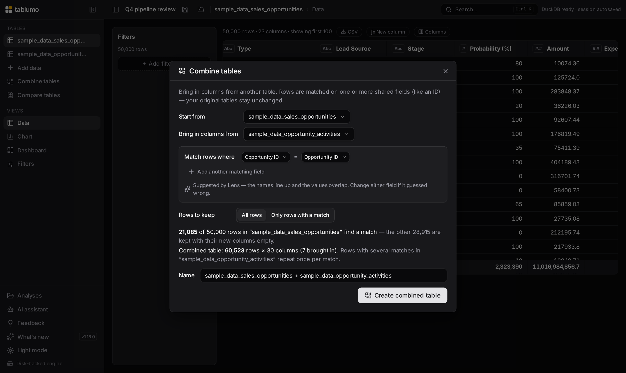
v2.234.0–v2.238.0 — “Combine tables” is now fully explained, the numeric range-filter handles describe themselves, and the starter sample cards say what a click doesJune 17, 2026 · 04:05 UTC
A wave of plain-words, display-only help on three more surfaces — every cue is computed from values already on hand, follows renamed columns, and is held back where it would mislead. The “Combine tables” dialog is now covered end to end: its top-level table pickers (v2.234) and the per-row matching-field pickers (v2.235) read as state-aware controls that name the tables and fields being joined, and the add/remove buttons for extra matching conditions now say which pair of fields they add or drop — and, when greyed out, why (v2.236). A numeric filter’s dual-handle range slider now gives each handle a state-aware hover hint: with a floor or cap set it names the bound and how to clear it, and with none it invites you to drag one in — currency-aware, mirroring the live value bubble (v2.237). And the starter sample-dataset cards finally explain themselves: hovering one spells out the click, the row × column size, and that the sample opens alongside any data you already have rather than replacing it (v2.238).
v2.229.0–v2.233.0 — The guided-AI option groups, the “Combine tables” keep-rows switch and the whole “Trend across versions” dialog now explain themselvesJune 17, 2026 · 03:40 UTC
A run that finishes off two more dialogs control-by-control, so every picker says what it does on hover and to a screen reader instead of carrying a flat label. In the guided “Build a dashboard with AI” flow, each multiple-choice question now reads as a proper single-choice group — naming the question, which option is selected, and that picking one replaces the last (v2.229). In the “Combine tables” dialog the “Rows to keep” switch now spells out the difference between keeping every row of the starting table and keeping only the rows that match (v2.230). And the “Trend across versions” dialog is now fully explained: the “Track” picker names the number it follows across snapshot versions and how many versions feed the line (v2.231); the “Summarized by” picker names the column it summarises, the aggregate in force and the result column it builds — “Sum of Amount”, one row per version (v2.232); and the closing “Name” box now says that leaving it blank keeps the Create button disabled and that the result is a normal table you can chart, filter and pivot like any other (v2.233). Every cue is a pure, display-only helper over values already on hand, follows renamed columns, and is held back where it would mislead.
v2.224.0–v2.228.0 — The last chart-builder picker and the whole “Build with AI” dialog now explain themselvesJune 17, 2026 · 03:15 UTC
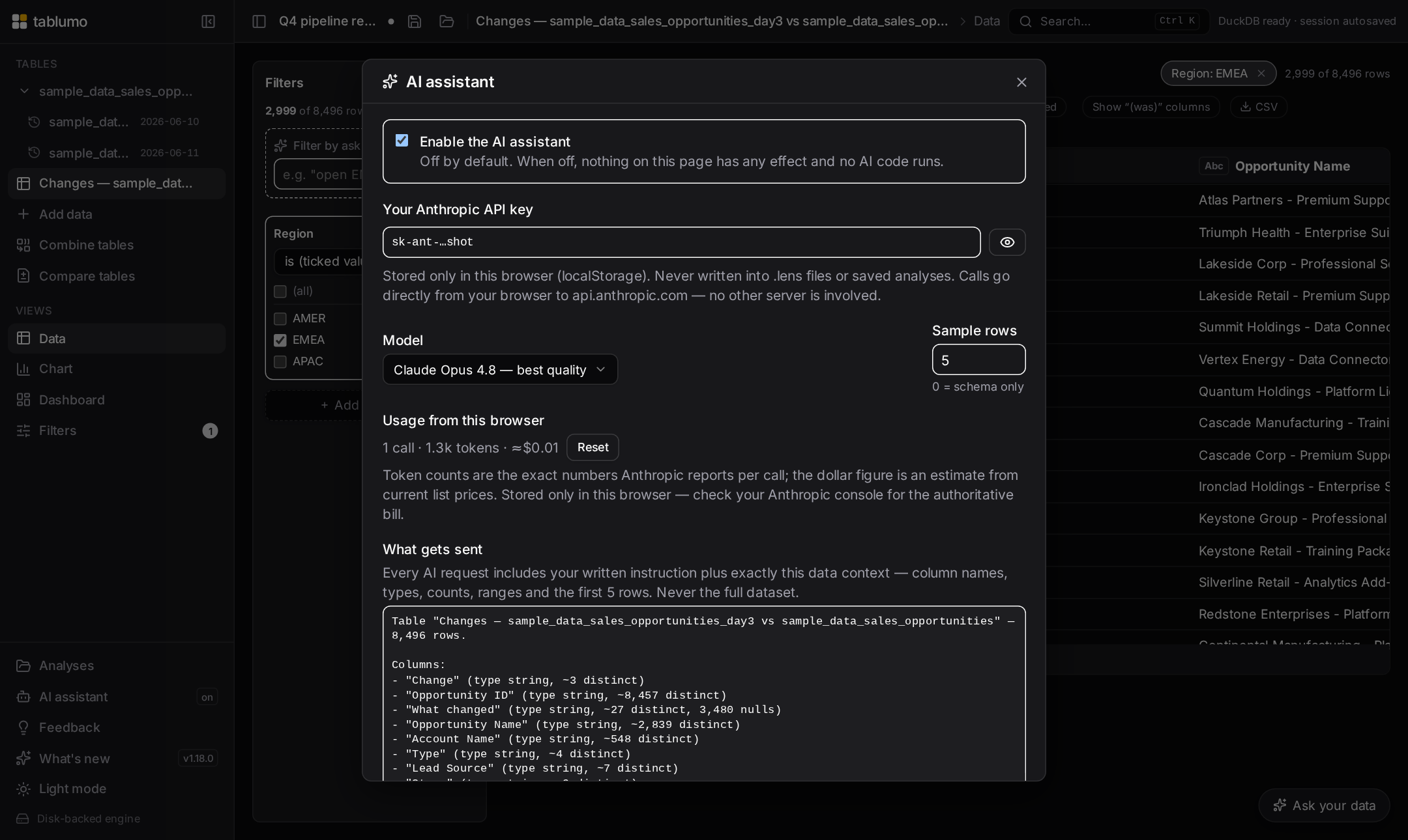
A short run that closes out the main chart panel and then turns to the AI dashboard surfaces, so every control says what it does on hover and to a screen reader instead of carrying a flat label. The chart panel’s top-level “Chart type” picker now names the visualization you’re on and that switching keeps your fields where they make sense — finishing the chart-builder affordance vein (v2.224). In AI settings, the “Model” picker spells out which model runs and that it only ever sees the schema and a small sample you control (v2.225), and the “Sample rows” box says exactly what those sample values are used for and the privacy trade-off of sharing more or fewer (v2.226). In the “Build a dashboard with AI” dialog, both prompt boxes — the one where you describe the board and the one where you refine the last build — now say how to submit (⌘/Ctrl+Enter), that the AI only proposes a plan you review before anything is built, and lead with a live character count as you type (v2.227). And the dialog’s guided questions now make their free-text “answer in your own words” box clear: it’s optional, leaving it blank skips the question, and typing in it overrides the option buttons above (v2.228). Every cue is a pure, display-only helper over values already on hand; the AI features stay settings-gated and nothing about them changed but the wording.
v2.219.0–v2.223.0 — The remaining chart-builder controls now say what they’re set toJune 17, 2026 · 02:44 UTC
The finishing pass over the main chart panel’s controls, so every compact picker explains itself on hover and to a screen reader instead of carrying a flat label. The line overlay (combo) measure and aggregation pickers now name the second series drawn over the bars and how it’s summarised (v2.219). A bubble or 3D scatter’s “Size by” and “Z (depth)” pickers say which field drives each dot’s size and its depth axis (v2.220). The Max points cap reads out the current ceiling and that bigger data is randomly sampled down to it — noting the 3D chart’s own lower hard limit (v2.221). The X labels angle picker names how the category labels will sit — “X-axis labels: Angled — labels tilt 45° to fit more long names without overlap” (v2.222). And the global Top N picker now says how many groups the chart keeps — “Top groups shown — currently: top 20 by value”, with the “All” state noting the 2,000-group safety ceiling (v2.223). Every cue is a pure, display-only helper over values already on hand, follows renamed columns, and is held back where it would mislead.
v2.213.0–v2.218.0 — Every chart-builder picker now says what it does and what it’s set toJune 17, 2026 · 02:10 UTC
A sweep across the main chart panel’s own builder, so the compact pickers that shape each chart type explain themselves on hover and to a screen reader instead of carrying a flat label. A scatter’s “X”, “Y” and “Colour by” pickers now name the field each drives — “Horizontal axis — currently: Spend…” (v2.213). A histogram’s “Column” and “Bins” pickers say what gets binned and into how many bands (v2.214). A category chart’s “X”, “Dates by”, “Split”, “Aggregation” and “Y” pickers name the grouping, time bucket, series split, summary and measure (v2.215). A heatmap’s “X”, “Y”, “Aggregation”, “Measure” and “Top N” pickers spell out the grid’s columns, rows, cell value and cap (v2.216). A Sankey’s “Flow from”, “Flow to”, “Aggregation” and “Measure” pickers name where ribbons start and end and how their width is computed (v2.217). And now a box plot’s “X (group by)”, “Values” and “Top N” pickers read out which category splits the data into boxes, which numeric column each box summarizes, and how many groups are kept — “Box plot group by — currently: Region… one box per distinct value, quartiles, median and min/max” (v2.218). Every cue is a pure, display-only helper over values already on hand, follows renamed columns, and is held back where it would mislead.
v2.208.0–v2.212.0 — Every dashboard-tile builder picker now says what it does and what it’s set toJune 17, 2026 · 01:30 UTC
A sweep that finishes the dashboard-tile story: each compact picker in a tile’s own builder now explains itself on hover and to a screen reader, instead of carrying a flat label. A bar or line tile’s grouping pickers name the field each drives — “Grouping bars by Region…”, the split, aggregate and Y measure alongside (v2.208). The refinement row’s “Dates by”, “Top N” and “Sort” pickers say how they bucket, cap and order the tile (v2.209). A Sankey or bubble tile’s “Flow from / Flow to / Agg / Y” and “Size” pickers name the source, target, measure and bubble-size field (v2.210). A tile shown as a grouped table explains its “Group by”, “then” and “Dates by” pickers — “Grouping rows by Region. Every row with the same value collapses into one summary row…”, and “None, showing raw rows” when nothing is grouped (v2.211). And now each value column’s summary and field pickers read out their slot and choice — “Summarising value 1 by average…”, “Summarising Revenue for value 1…”, “Value 1 summary — currently: Sum” (v2.212). Every cue is a pure, display-only helper over values already on hand, kept honest about row summaries versus chart axes and held back where it would mislead.
v2.203.0–v2.207.0 — Match-mode, compare, pivot and dashboard-tile pickers all explain themselves nowJune 17, 2026 · 01:00 UTC
Another sweep that turns silent form controls into ones that say what they do and what they’re set to, on a hover and to a screen reader alike. In the Filters panel the Match-mode dropdowns now spell out each choice — contains, starts with, exactly, and so on (v2.203). The Compare-tables pickers name the before, after and key columns each is set to (v2.204). The pivot table’s “Show values as” picker explains every option — % of row, % of column, running total and the rest (v2.205). The calculated-column Currency-conversion form’s two pickers now say a NEW column is added at the rate you type while your source data stays put, and that rates are never fetched online (v2.206). And on a dashboard, a histogram or scatter tile’s own “Column”, “Bins”, “X” and “Y” pickers now name the field each drives and what the chart shows — “Binning: Amount…”, “Horizontal axis: Spend…” (v2.207). Every cue is a pure, display-only helper over values already on hand, honest about its wording and held back where it would mislead.
v2.198.0–v2.202.0 — The chart inputs and the grouping & filter dropdowns now say what they do and what they’re set toJune 17, 2026 · 00:26 UTC
A run that turns the remaining silent controls on the chart, grouping and filter surfaces into ones that explain themselves to a hover and a screen reader alike. On a chart, the Reference lines button now names whether any guide lines are on and what it toggles (v2.198), and the bullet chart’s Target box says what value every bar is measured against and how to change it — “Bullet target — currently 50,000” (v2.199). In the grouped Data view, the “Show” measure dropdown now names which number each group is displaying — “Measure shown — currently Sum of Amount” (v2.200) — and the dashed “+ Add column” menu says where the column you pick lands, nesting as a deeper sub-group level inside the columns already grouped (v2.201). And in the Filters panel, the dashed “+ Add filter…” menu now tracks state — “Add a filter — 5 columns available”, “Add another filter — 2 active, 5 columns available” — and explains on hover that rows must match every active filter and that the same column can carry more than one (v2.202). Every cue is a pure, display-only helper over values already on hand, honest about counts and singular/plural, and held back where it would mislead.
v2.193.0–v2.197.0 — The grouped summary table now narrates every part of its conditional formattingJune 17, 2026 · 00:00 UTC
A run that finishes naming the column across the whole summary-table formatting control, so a keyboard or screen-reader user is never left guessing what a button does. A group row’s expand ▸ chevron now names the exact group it opens — “Expand — show the rows where Region is EMEA”, joining nested levels with “and” and reading a null value as “is empty” (v2.193). The subtotal row and the Subtotals button now spell out their own effect in words (v2.194). When two cell-fill styles can’t both be on, turning one on now warns that it replaces the other rather than silently swapping (v2.195). And the highlight rule, finished in two steps: its two threshold boxes (“Green at” / “Red at”) now lead with the column and, once both numbers are set, state the direction the engine infers — “Amount: highlight green at this value and higher” (v2.196); and its green/amber/red legend now reads out which column those colours paint — “Amount highlight rule: 80k and up green · 50k and below red · amber between” (v2.197). With several measures, where the target is ambiguous, each keeps its original column-agnostic wording. Every cue is a pure, display-only helper over values already on hand, honest about counts and singular/plural, and held back where it would mislead.
v2.187.0–v2.192.0 — The grid, the pivot and the summary table all say more about what a click will doJune 16, 2026 · 23:59 UTC
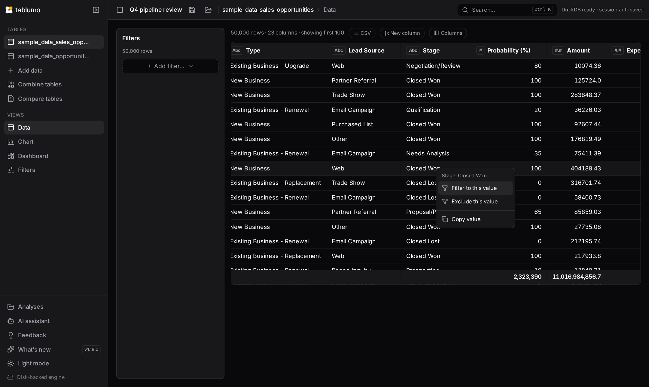
A run that finishes the clipboard set and then turns to the affordances you hover before clicking. From the grid you can now copy every visible column name as a comma-separated list (v2.187) and copy a whole row as TSV or JSON from the cell menu — the grid parallel to the record card’s copies (v2.188). Then the hover cues: a cross-tab header now explains itself, naming the dimension and pinning the honest per-axis and grand-total share rather than just echoing the label (v2.189); a filter chip’s ✕ names the exact condition it clears, spelled out in full so two chips on the same column are never a guess — “Remove this filter — Amount: 10,000 – 50,000” (v2.190); every summary-table column header states which way a click will sort, in that column’s own words — “Click to sort by Region (A → Z)”, “…(oldest first)”, “…(largest first)” — and the column you’re already sorted by states its order and the flip (v2.191); and the small aggregate ▾ caret on each measure now says how the column is summed and what you can switch to — “Amount is summarized as sum. Click to switch to Average, Median, Mode or 10 more.” (v2.192). Every cue is a pure, display-only helper over values already on hand, honest about counts and singular/plural, and held back where it would mislead.
v2.181.0–v2.186.0 — Grouped views, empty queries and the clipboard all explain themselves nowJune 16, 2026 · 23:59 UTC
A run of small, honest cues across the summary and copy surfaces. The data-quality scorecard now reads cell-level completeness — the percent of all cells filled and how many are empty, alongside the overall score (v2.181). The read-only SQL console now explains a query that matched no rows in plain words rather than showing a bare empty grid (v2.182). Two plan-legibility threads landed on the grouping surfaces: the Group-values dialog spells out exactly what its button will build — “Adds “Country (grouped)”: 5 values fold into 2 buckets; everything else keeps its original value.” (v2.183) — and the grouped Data view gained a calm caption stating, in one sentence, what it’s showing — “One row per Region, showing sum of Revenue.”, flipping to the cross-tab wording when you switch on the Pivot layout (v2.184). Then the clipboard: right-clicking a cell and choosing “Copy value” now confirms what it copied — “Copied “West” from Region to the clipboard.”, with empty-cell wording and an ellipsis clip for long text (v2.185); and the column header’s new “Copy column name” action puts the exact header text on your clipboard with the same calm confirmation — handy when pasting a column into a formula, SQL or a filter elsewhere (v2.186). Every cue is a pure, display-only helper over values already on hand, honest about counts and singular/plural, and held back where it would mislead.
v2.176.0–v2.180.0 — Every build dialog now spells out exactly what it will create, and the last empty-filter gets explainedJune 16, 2026 · 23:55–23:59 UTC
A run that completes two threads at once. The plan-legibility set: each dialog that builds a new table or column gained a calm one-sentence statement of intent, sitting right beside its action button and updating live as you change settings. The trend-across-versions dialog spells out the exact table it will build (v2.176); the ƒx new-column dialog states what Add will do — its name, type and row count (v2.177); the compare-tables dialog states the pair, key, name and the diff counts Create will produce (v2.178); and now the Combine-tables dialog reads, before any row counts even load, “Create “Orders + Customers”: combine “Orders” with “Customers”, matched on 1 field, keeping every row of “Orders”, and bringing in 3 columns from “Customers”.” — switching to “keeping only the rows that match” for a matches-only join and “bringing in no new columns” when nothing is ticked (v2.180). Every build dialog now states its intent in one plain sentence next to its button. Alongside, the last empty-filter foot-gun closed: untick every value in a categorical “is one of” filter and a calm line now explains the view is empty and how to fix it (v2.179) — completing that set across numeric range, date range, text and categorical filters. Each cue is a pure, display-only helper over values already on hand, honest about singular/plural, and held back where it would mislead.
v2.170.0–v2.175.0 — Summaries, cross-tabs and charts now spell out their format and their dead endsJune 16, 2026 · 23:00–23:59 UTC
A run that finishes two honesty threads across the summary surfaces. First the formatting cues: a grouped-table’s totals footer now captions how each total is displayed — “shown as USD currency”, “as percent ×100, 1 decimal”, “as thousands, 0 decimals” (v2.170); a cross-tab header says the same when its cells carry a currency, percent or number format (v2.172); and now a chart’s value axis and tooltips carry a one-line caption — “Axis & tooltip values shown in USD.”, “…as percent (×100, 1 decimal).”, “…with thousands, 0 decimals formatting.” — so a bare “$” or “%” on an axis no longer leaves you guessing whether the tooltip rounds or multiplies a ratio by 100 (v2.175). The drill-down header also gained a plain read of its active sort order — “Sorted by Amount, high to low” (v2.171). Then the explain-don’t-go-blank thread closed: a cross-tab (v2.173) and a grouped/summary table (v2.174) filtered down to no rows now state a calm one-line reason above the empty grid — “the current filters removed every matching row” — instead of rendering a bare header. Together with the earlier grid and chart work, all four data surfaces now name their own dead ends, and the four value surfaces all say their format out loud. Every cue is a pure, display-only helper over values already on hand, honest about singular/plural, and held back where it would mislead.
v2.164.0–v2.169.0 — Empty views, drill-downs and the record card now explain themselvesJune 16, 2026 · 00:00–00:55 UTC
A run of small, honest cues on places that used to go blank or stay silent. An empty grid now explains why it’s empty — filters, a search, or hidden rows — and offers a one-click way back instead of leaving you staring at nothing (v2.164), and a category chart filtered down to no rows now says so in words rather than vanishing (v2.165). The drill-down header grew two quiet companion lines: it states the selection’s share of the whole table — “312 rows · 4% of the table” (v2.166) — and owns up when the drill-down is hiding columns — “Showing 12 of 30 columns (18 hidden)” (v2.167). Then the number-formatting cues: the column-header menu now spells out which format is on — “Percent: ×100, 1 decimal…”, “Number: thousands, 0 decimals…”, “Number: compact (1.2M)…” — so you can read the current setting without diving into the submenu (v2.168); and the record card now captions how each number is being displayed — a small grey “shown as USD currency”, “shown as percent ×100, 1 decimal”, “shown as thousands, 0 decimals” beneath any reshaped value, with per-row currencies naming their actual code (“EUR currency”) — so a formatted figure can never be mistaken for the raw one (v2.169). Every cue is a pure, display-only helper over values already on hand, honest about singular/plural, and held back where it would mislead.
v2.159.0–v2.163.0 — Exports and copies now tell you what just landedJune 16, 2026 · 23:20–23:55 UTC
A run that closes the loop on the moments data leaves the app — every one used to finish in silence. Export now confirms the file landed instead of just dropping it in your Downloads: the four CSV/Excel table exports each say so (v2.159), and the same calm note reached the read-only SQL console export, naming the row count so you know the file holds every result row, not just the visible page (v2.160); the grouped-summary CSV export does the same, naming the full group count — “Exported all 2,000 groups — the CSV is in your downloads.” — even though the view shows only the top 500 (v2.161); and saving a chart as a PNG now names which chart it captured — “Exported the bar chart — the PNG is in your downloads.” (v2.162). Then the same honesty moved to the clipboard: copying from a record card — the TSV/JSON/MD buttons, the “All” copy, or any single field — used to flash a bare “Copied” check that never said what you’d grabbed. A new line beneath the copy row now spells it out: “Copied all 12 fields as JSON.”, “Copied the 3 shown fields as tab-separated text.”, “Copied all 480 records as a Markdown table.”, or “Copied the Customer ID value.” — and as a live status line, screen readers announce the same thing sighted users see (v2.163). Every cue is a pure helper over values already on hand, honest about counts and singular/plural, and held back until there’s something real to confirm.
v2.149.0–v2.153.0 — Filters and formulas now explain themselves instead of failing quietlyJune 16, 2026 · 22:13–22:38 UTC
A run of small, honest cues on the moments where a control could quietly do the wrong thing — or nothing at all. Applying a saved view now names the filters it skipped when the saved filter points at a column the current table doesn't have, so a partially-applied preset can't surprise you (v2.149). A mistyped column in a ƒx formula now says so in plain words — naming the typo and what to check — instead of surfacing a raw database error (v2.150). And a quartet of empty-result foot-guns gained matching calm inline notes: a numeric range filter whose minimum is above its maximum now says “This range is empty…” rather than silently clearing the view (v2.151); the date range filter does the same when the start date lands after the end date, naming both dates in a readable Mon D, YYYY form (v2.152); and a text “contains” filter left blank now says it “isn’t doing anything yet — type some text to keep only rows where Owner contains it,” the mirror image of the range notes (an empty needle keeps every row, an impossible range keeps none) (v2.153). Every cue is a pure helper over values already on hand, names the column, and leaves the controls fully editable while it shows.
v2.144.0–v2.148.0 — Combining, checking and naming things now spell out what they didJune 15, 2026 · 21:38–22:05 UTC
A run of small, honest cues across data-combining, data-quality and the dashboard. Combine tables now confirms whether the linking field stayed unique after the join — tying the “(near-)unique key” it picked to the fan-out it actually measured, so a join that quietly multiplied rows can’t hide (v2.144). The Data Quality scorecard opens with a plain-English overall verdict — “6 of 10 columns need attention” — in one honest sentence (v2.145), and a second line right beneath it points you at the column to start with: “Start with Region — its 34 / 100 is the lowest score” (v2.146). When several files or a multi-sheet workbook land at once, the import confirmation now names the tables — “Imported 3 tables — “Sales”, “Costs” and “Regions” — 1,234 rows total.” — naming the first three then counting the rest (v2.147). And renaming a dashboard tile now tells you the automatic name you can fall back to — “clear the box to use the automatic name “Sum of Amount by Region”” — so you can see what clearing the field would restore without wiping your text to find out (v2.148). Every cue is a pure helper over values already on hand, held back where it would mislead.
v2.139.0–v2.143.0 — Combining tables now explains its own suggestionsJune 15, 2026 · 20:58–21:32 UTC
A run that makes the Combine tables dialog talk you through its guesses instead of just making them. Two ƒx formula surfaces opened things off — the New-column dialog’s insert-column chips now lead their tooltip with the column’s plain-language type (v2.139), and the calculated-columns list names each formula’s result type in plain words (v2.140). Then the join-key work: the key picker now flags a (likely) unique field right in the dropdown — comparing its distinct-value count to the row count, so you can spot the clean identifier at a glance (v2.141); the app prefers that unique key by default, steering its suggestion toward the one that won’t accidentally multiply your rows (v2.142); and now the suggestion note tells you why — “matched on the shared ID “Order ID”, a unique value that links each row once,” or “matched on the shared field “Email”, (near-)unique in the table you’re adding, so the join won’t fan out” (v2.143). You can sanity-check the guess instead of taking it on faith. Every cue is a pure helper over numbers already on hand, and falls back to the plain wording when there’s nothing distinctive to point to.
v2.133.0–v2.138.0 — Every column picker now names a column’s type in plain wordsJune 15, 2026 · 20:21–20:53 UTC
A run that makes a column’s kind readable wherever you choose one. First, the rename-column dialog now spells out exactly what Save will do before you commit (v2.133). Then a single plain-language type label — “Whole number”, “Date & time”, “Text”, “True/False” — spread to every place you point at a column: the preview-table header and Columns picker badge (v2.134), the data-quality column sub-label (v2.135), the filter add-column picker (v2.136), the chart X / Group / Split / Colour-by dropdowns (v2.137), and now the Combine-tables join-key picker (v2.138). In each, hovering a column used to show only its distinct-value count; it now leads with the type, then the count — “Text · 4,200 distinct values in this column”. The type is what tells you how the values behave: what kind of axis a column makes, whether a filter gives you a slider or a checklist, or — for a join key — whether the two sides can even line up. All six surfaces route through one shared helper, so they describe a column identically and can never drift.
v2.127.0–v2.132.0 — Import, export and table-combining tell you plainly what just happenedJune 15, 2026 · 19:36–20:12 UTC
A run of small, truthful cues on the moments where data moves in, out, or together. The “Versions to keep” dialog now shows the whole series’ total size, not just one snapshot (v2.127). Export file names now carry the time of day so two same-day exports never collide (v2.128), and the export progress message says (filtered) when you’re exporting a filtered view rather than the whole table (v2.129). When a file finishes importing, a brief toast names the table and its shape — “Imported ‘Sales’ — 50,000 rows × 12 columns.” (v2.130). And the two “bring data together” dialogs now lead with a plain-language verdict above their counts: Compare two tables opens with “Net +900 rows · 89% of the earlier rows unchanged.” (v2.131), and combining tables opens with “Strong match — about 92% of rows find a partner.” / “Weak match — only about 12% of rows find a partner.” (v2.132). Each is a pure helper over numbers already on hand, honest about rounding — never “100%” on a partial match, never “0%” on a real one.
v2.122.0–v2.126.0 — Calculated columns and a few dialogs get more honest about themselvesJune 15, 2026 · 19:03–19:30 UTC
A run of small, truthful cues placed where you'd otherwise be guessing. The “Versions to keep” dialog now opens with how many snapshots you have and how far back they reach (v2.122). The data-quality scorecard adds a quiet positive line — “8 columns are spotless” — beside its “needs attention” note (v2.123). And the ƒx calculated-columns list got three honest reads: each column now names the source fields its formula reads — a quiet “from Amount, Quantity” — on both active rows (v2.124) and on a removed column's “re-add” row (v2.125); and a column whose formula references a field that no longer exists now shows a red ⚠ naming the missing column, so you know editing or re-adding it would fail before you try (v2.126). Every cue is a pure helper over numbers already on hand — honest pluralization, true zeros, and held back entirely where it would mislead.
v2.117.0–v2.121.0 — A quiet "how many" cue on the surfaces where it was missingJune 15, 2026 · 18:30–18:54 UTC
A run of small, honest counts placed exactly where you'd otherwise be left counting by hand. The read-only SQL console schema panel now counts each table's columns (v2.117). A value filter tells you how many of its values you've kept — "5 of 12 selected" (v2.118) — and its mirror, the exclude-values filter, tells you how many you're hiding (v2.119). Right-click a dataset in the sidebar and its menu now shows the table's shape under the name — "12,345 rows × 8 columns" — before you open it (v2.120). And the ƒx New-column dialog's list of calculated columns now leads with a count — "3 calculated columns on this table" (v2.121). Each cue is a pure helper that reads numbers already on hand, pluralizes honestly, and reads a true "0" rather than a misleading blank.
v2.111.0–v2.116.0 — Every chart's Key findings now own up to what its shape hidesJune 15, 2026 · 17:30–18:15 UTC
A sweep across the chart types, each gaining the one honest read its glyph implies but won't let you measure. A funnel now names its biggest single drop-off and its end-to-end conversion — and suppresses the misleading "% of total" shares that never made sense on a funnel (v2.111–v2.112). A waterfall states its net change and its biggest single move (v2.113). A treemap owns up to the tail of tiny tiles it can't show — "7 of 32 tiles are each under 1%, together just 3%, too small to compare by area" (v2.114). A radial bar says how little of the ring its shortest wedge fills, a length read that stays honest even on an average or a min (v2.115). And a heatmap now names its coolest cell alongside its hottest, so both ends of the colour ramp read at a glance (v2.116). Every cue appears only where it's genuinely informative and held back where the number would mislead.
v2.106.0–v2.110.0 — The ƒx formula box and SQL console get easier to work inJune 15, 2026 · 16:46–17:21 UTC
A run of ease-of-use work on the two power-user surfaces. The ƒx New-column formula box gained a built-in function reference — a collapsible list of common Math, Text, Date & Logic functions, each with its signature and a plain-language description, that drops a ready-to-fill skeleton at your cursor on click (v2.107.0); select a column first and the function now wraps your selection as its first argument (v2.108.0). The read-only SQL console’s schema reference got a search box that narrows the table/column list as you type — table-name matches keep all columns, column-name matches show exactly which tables carry that field (v2.109.0) — and the matching substring is now highlighted in place so you can see why each row survived the filter (v2.110.0). And a cross-tab now names its Pareto “vital few” — how few cells carry the bulk of the total (v2.106.0).
v2.100.0–v2.105.0 — Every "where do I stand" chart now reads out the distance, not just the shareJune 15, 2026 · 15:50–16:34 UTC
The plain-language idea moved onto the goal-and-ranking charts, each adding the one fact the glyph hints at but won't let you read precisely. A funnel stage now says its conversion from the stage above — "62% of the previous stage" (v2.100.0). A waterfall step says how much of the running total it is (v2.101.0). A radial bar says where it ranks and how it measures up to the longest — "2nd longest of 5 · 50% of the longest wedge" (v2.102.0). A KPI dial now names what it's filling toward — "40% of goal 100" vs "40% of total 100" (v2.103.0) — and how much is left to hit the goal — "30 to go", "20 over goal", or "goal met" (v2.105.0). And a bullet chart says how far off target you are in real units — "20 short of target", "50 over target", or "on target" (v2.104.0). Every cue is display-only and honestly held back where the number would mislead — no gap line without a real goal or target, no false zeros — so it never claims more than the data supports.
v2.94.0–v2.99.0 — Tables, cross-tabs and a record card learn to read their own headline numberJune 15, 2026 · 14:50–15:42 UTC
The same plain-language idea spread to the surfaces beyond charts. A summary table now reads its concentration — "12 groups · top group is 47% of the total" (v2.94.0) — and its "vital few" — "just 3 of 14 groups make up 80%+", the fewest leading groups that together clear 80%, with the exact cumulative share on hover (v2.98.0). A cross-tab names its busiest cell — "The busiest cell is West × Won, 31% of the total" (v2.95.0). A heatmap says how gappy the grid is — "14 of 60 cells empty" (v2.96.0). A record card names which fields are blank when it's a short list — "Hide the 2 empty fields: Region, Notes" (v2.97.0). And a histogram bar that isn't the tallest now reads its height against the peak — "62% as tall as the tallest bin" (v2.99.0). Every cue is display-only and honestly held back where the number would mislead — silent when a table is capped, when a heatmap is fully dense, or when a histogram is perfectly flat — so it never claims more than the data supports.
v2.88.0–v2.93.0 — Charts that read out their own headline numberJune 15, 2026 · 13:58–14:34 UTC
A run of plain-language cues spread across three more chart types, each naming the one fact the picture hints at but won't let you read off precisely. On a histogram, hovering the tallest bar now confirms it — "tallest bin" — since across a row of near-equal bars the eye can't reliably pick the mode (v2.88.0), and the shape caption now also names where the peak sits for a single-peaked column ("right-skewed, peak near $40", v2.89.0). A heatmap now names its hottest cell outright in the axis caption ("hottest: Q4 × West ($1.2M)", v2.90.0), and hovering any cell says how warm it is next to the peak ("60% of the hottest cell", v2.92.0) — because colour hints at size but you can't read an exact proportion off a gradient. And the sankey learned to quantify flow: hovering a ribbon says how much of the total it carries ("34% of all flow", v2.91.0), and now hovering a node — a source or target box — says how much of the flow runs through it ("83% of all flow", v2.93.0), with sources and targets each adding up to the whole. All plain-language, display-only, honestly held back where the number would be noise, and consistent between caption and hover tooltip.
v2.82.0–v2.87.0 — A box plot that explains its own shapeJune 15, 2026 · 13:05–13:46 UTC
The box plot gained an always-visible, plain-language caption — the box-plot counterpart to the scatter trend caption — so the facts the glyph hides are readable without a hover. Across a row of boxes it names the group with the widest middle 50% (the tallest box, since box heights are far harder to rank by eye than the medians, v2.82.0) and the group whose whisker reaches furthest past the 1.5×IQR outlier line ("· SMB has high outliers", v2.83.0). When the boxes run left-to-right by time, the caption brackets the series — naming the highest-median period (v2.84.0) and, with three or more periods, the lowest-median trough too ("March has the highest median ($120), September the lowest ($40)", v2.86.0) — because a time axis drops the value sort the eye relies on. A single box reads as a sentence instead: median, middle-50% spread, skew and which tail runs longer (v2.85.0). And now a long tail says how far it actually reaches — "long high tail (18.3× box)", measuring the dominant whisker in box-heights (v2.87.0) — shown only when one tail genuinely dominates, the box has real height, and the tail clears at least one full box. All plain-language, display-only, and consistent between the caption and the hover tooltip.
v2.77.0–v2.81.0 — A scatter trend line that explains itselfJune 15, 2026 · 12:20–12:52 UTC
The fitted trend line on a scatter learned to read itself out in plain language, so you don't need a stats class to use it. A plain scatter's caption now spells out the line's equation in your column's own units ("Trend: y ≈ $1,235·x − $42 · R²=0.87 · Strong", v2.77.0), the break-even point where the line crosses zero — but only when that crossing actually sits inside your data, never extrapolated ("· y=0 at x ≈ 142", v2.78.0) — and the total rise or fall across the range you're looking at ("· Δy ≈ +$1.2M over range", v2.79.0). On hover, the R² now reads itself out: "R²: 0.873 — explains 87% of the variation" (v2.80.0). And a weak fit is honest about how weak — the always-visible caveat now names it too: "R²=0.04 — explains 4% of the variation; points barely follow this line" (v2.81.0), with a tiny-but-real fit reading "<1%" rather than a false 0%.
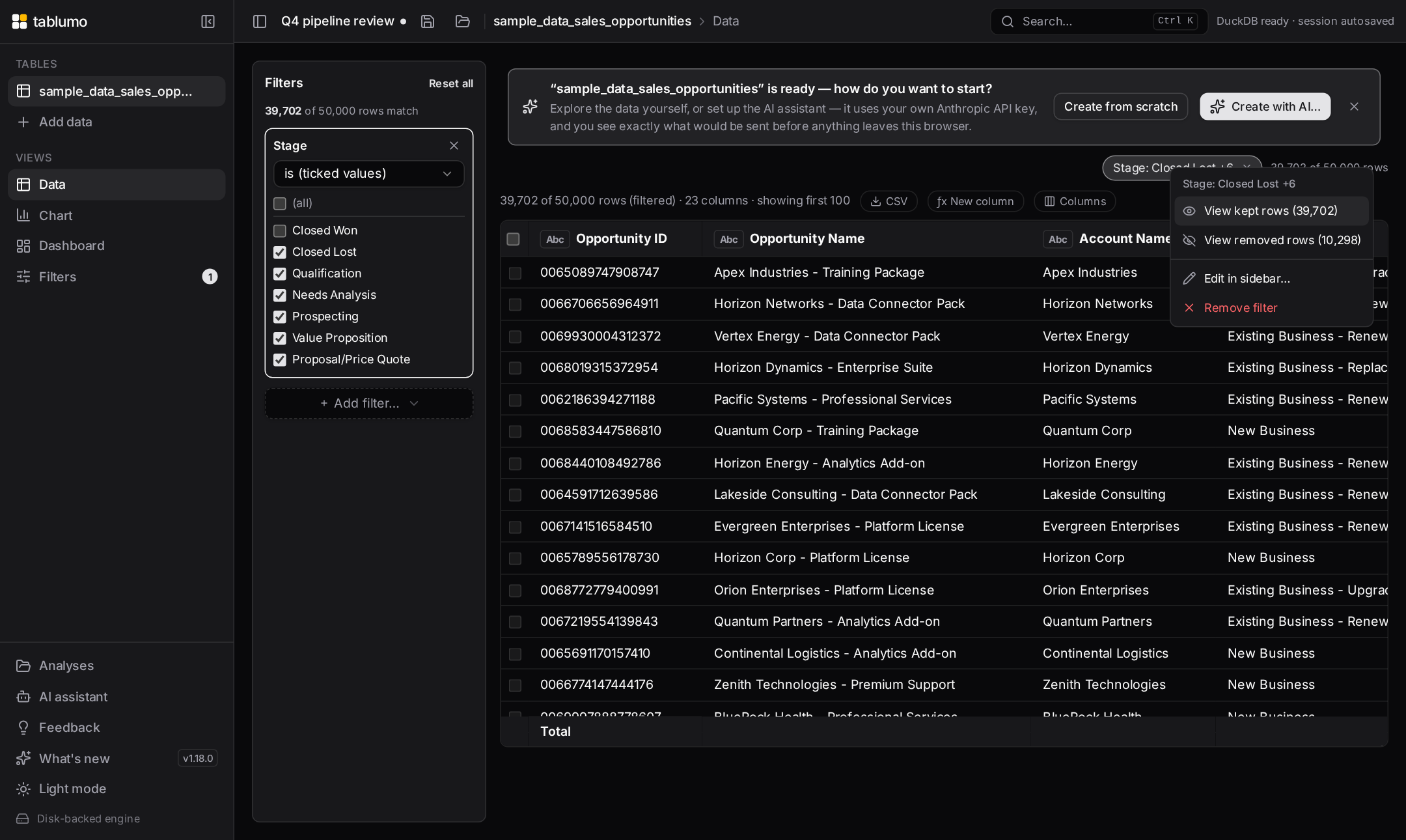
v2.72.0–v2.76.0 — Filter chips that stay compact and never hide anythingJune 15, 2026 · 11:45–12:15 UTC
The filter chip bar got a run of tidy-up so a single chip can never sprawl across the whole bar and shove the others — and the row count — off-screen, while still keeping every exact detail one hover away. Hovering the "Clear all" button now names the columns it will wipe ("Removes all 5 filters across 3 columns: Region, Amount, Close Date.", v2.72.0), and hovering any chip spells out every value it filters on in full, even when the face shows a "+3" (v2.73.0). Then the chip faces themselves learned to stay narrow: an over-long value ("Account: International Business…", v2.74.0), an over-long "contains" search ("Account contains "International Business…"", v2.75.0) and now an over-long column name ("Annual Recurring Reve…: EMEA", v2.76.0) are each clipped on the chip face with an ellipsis. Nothing is lost: hover the chip to read the full text, and the right-click menu, drill titles, sidebar editor and the assistant all keep the exact, complete value. Everyday short chips look exactly as before.
v2.66.0–v2.71.0 — The drill-down's copy options, and a clearer filter countJune 15, 2026 · 10:50–11:38 UTC
Two small parts of the app got more honest about what they're showing. The drill-down's Record view learned to copy a record as JSON or as a Markdown table, and to copy the whole drill-down at once as a Markdown table — so a row you found while reading drops cleanly into a doc, a ticket or a script — with a brief ✓ confirming each copy. And the filter chip bar sharpened up: when a single column carries several chips you can now clear that whole column in one step from the chip menu, the "Clear all" button states the count it will wipe ("Clear all 5 filters"), and hovering the "12,345 of 50,000 rows (25%)" readout now spells out how many rows are hidden in plain words — so the size of what your filters hold back is one hover away instead of a subtraction in your head.
v2.61.0–v2.65.0 — The record card, sharpened for wide and sparse dataJune 15, 2026 · 10:05–10:45 UTC
The drill-down's Record view gained a run of details-on-demand polish. A small "N of M fields empty" note now sits beside the counter so a sparse record reads at a glance — and it doubles as a toggle: click it to hide every empty field and collapse the record down to just the fields that carry data, click again to bring them back. The Find a field box now highlights the matching text right inside each field's name and value, so you see exactly what your search caught, and Copy grabs just the fields you've narrowed to — "Copy 3" — instead of silently copying rows scrolled out of view. And the "Record N of M" counter is now editable: type a record number and press Enter to jump straight to it across a 500-row drill-down, with the arrows, the ←/→/Home/End keys and the jump field all sharing one set of bounds so you always land on a real record. The in-app manual's "Reading the rows one at a time" section documents all of it.
v2.56.0–v2.60.0 — Read one row at a time, with details on demandJune 15, 2026 · 09:15–09:55 UTC
Drilling into the rows behind a value gained a Record view: a Table / Record toggle flips the rows window from the familiar grid to a single record laid out vertically — every field down the page, in the same currency, percent, number and renamed-label formats as the grid — so a row with many columns reads cleanly instead of scrolling sideways. You can copy the whole record as one label-and-value line per field, or copy a single field (an id, email or code) from its own button. Paging is fluid: the ‹ › arrows or, straight from the keyboard, ←/→ to step one record, Page Up/Page Down to jump ten, and Home/End for the first and last. A Find a field box filters the card by field name or value, and now shows a small "N of M fields" count so you can see at a glance how far a search narrowed a very wide record. The in-app manual's new "Reading the rows one at a time" section documents all of it.
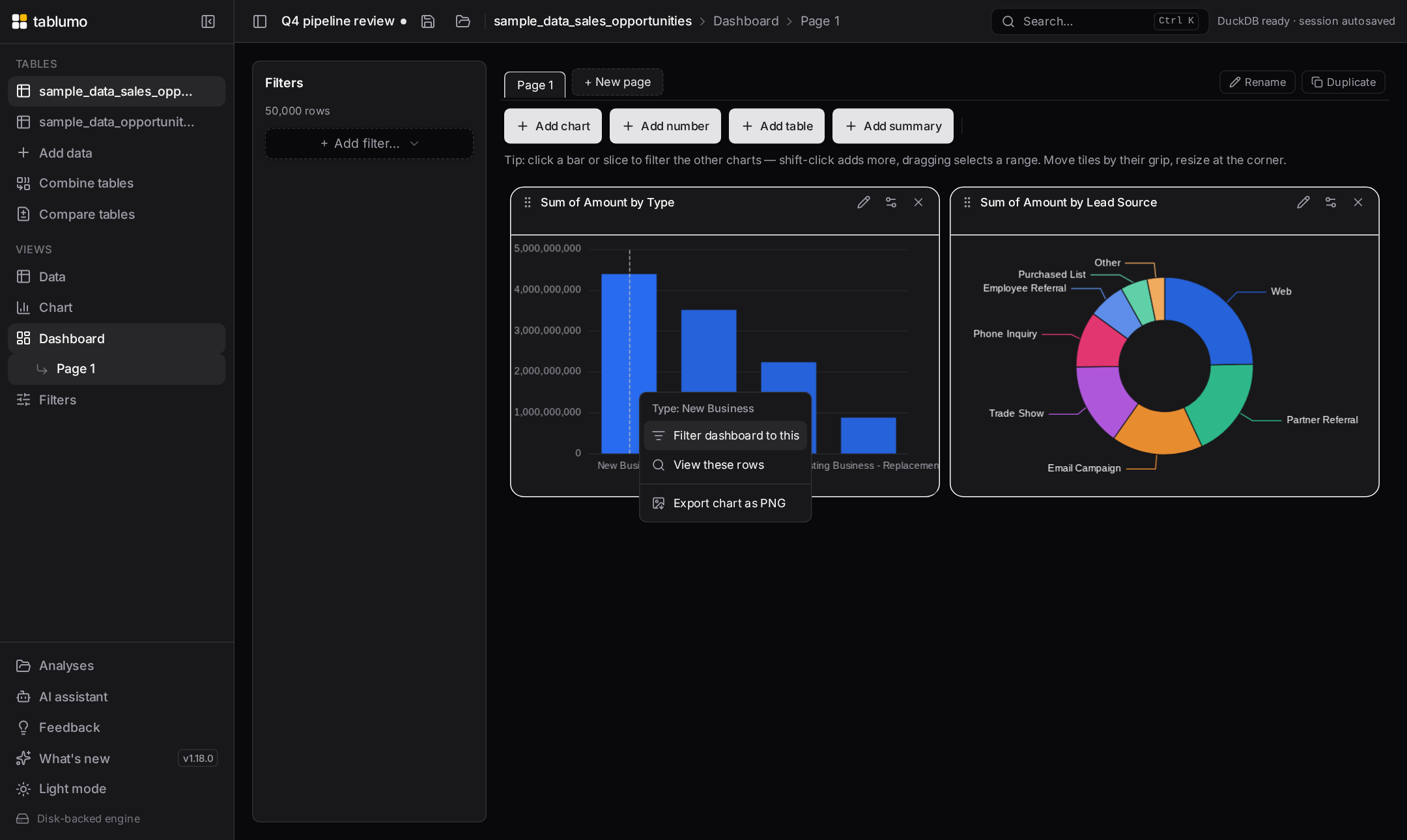
v2.51.0–v2.55.0 — Filters at three levels, and a guide that can't driftJune 15, 2026 · 00:30–09:05 UTC
Dashboards gained filters at three levels that stack: global filters narrow the whole dataset, page filters narrow one dashboard page, and tile filters narrow a single chart or KPI — combined with AND, each level only narrowing further than the one above. Every level is shown plainly so a number is never filtered invisibly: global chips in the sidebar, page chips under the tabs, and a small filter flag in a tile's header when it carries filters of its own. The manual now spells out the exact order they apply in — global, then page, then tile, then a momentary cross-filter selection on top — and the difference between those persistent filters and transient click-to-cross-filter marking. And the website user guide is now generated from the same in-app manual, so the guide you read here and the handbook inside the app can never fall out of step.
v2.41.0–v2.50.0 — The user manual covers the whole appJune 14–15, 2026 · 22:46–00:20 UTC
The in-app handbook filled out its remaining areas, so every feature is now documented from the single shared source. New sections cover key findings, saving and reopening your work (autosave, named analyses and .tablumo files), keyboard shortcuts and the command palette, and using Tablumo on a phone or tablet. Reference areas followed: the optional AI assistant (opt-in, what it sends, what it can do), privacy and local-first (where your data lives and the few things that ever touch the network), exporting data, charts and summaries, and large files and the disk-backed engine. The latest area, Versions & comparison, explains tracking versions of a table (keep a newer export as a dated version, or append its rows into one growing table) and comparing and trending versions (see exactly what changed between two versions, and chart one number across a whole series as a line over the dates). Every section is searchable, deep-linkable and works in both themes.
v2.36.0–v2.40.0 — The manual covers every chart type, dashboards and pivotsJune 14, 2026 · 21:54–22:35 UTC
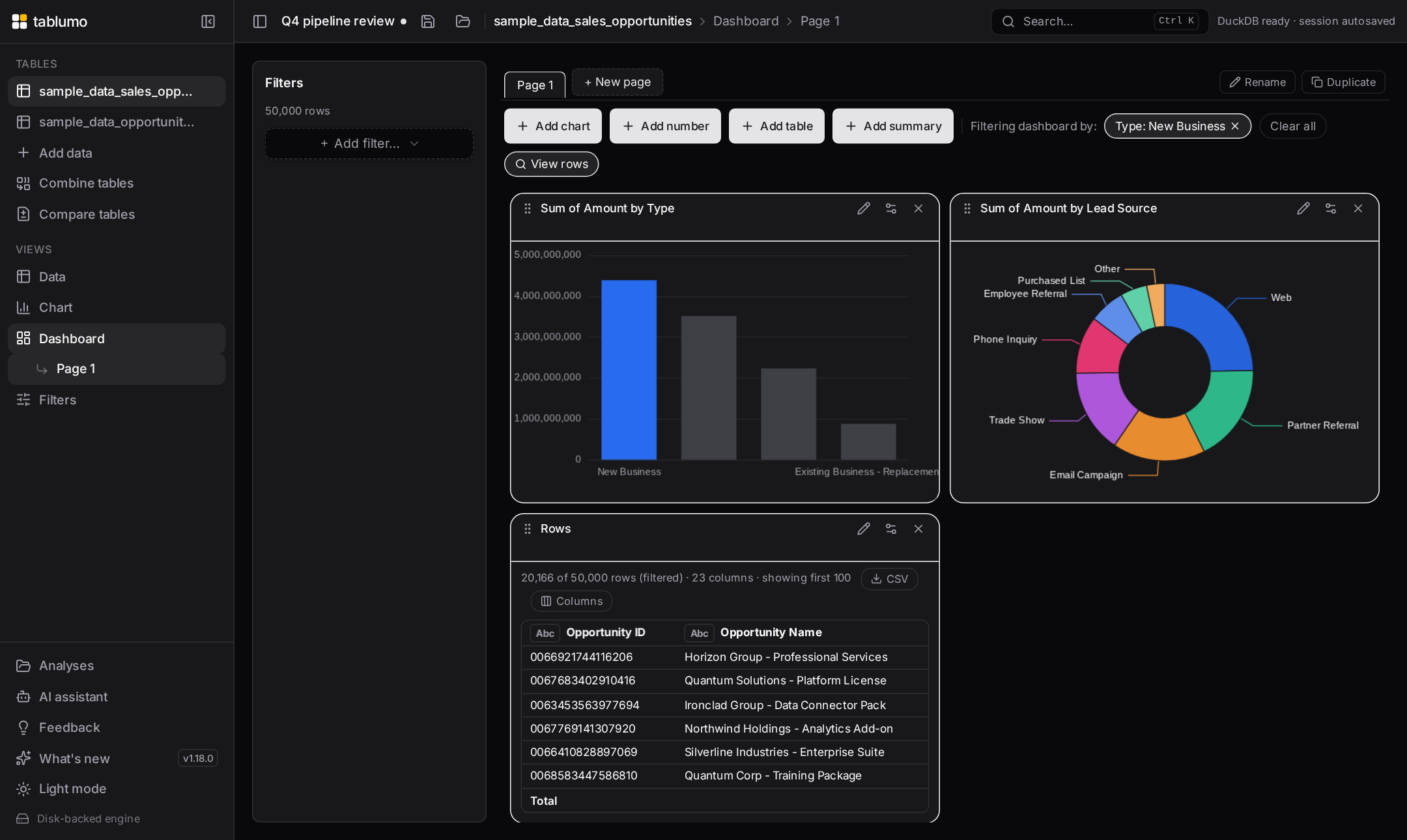
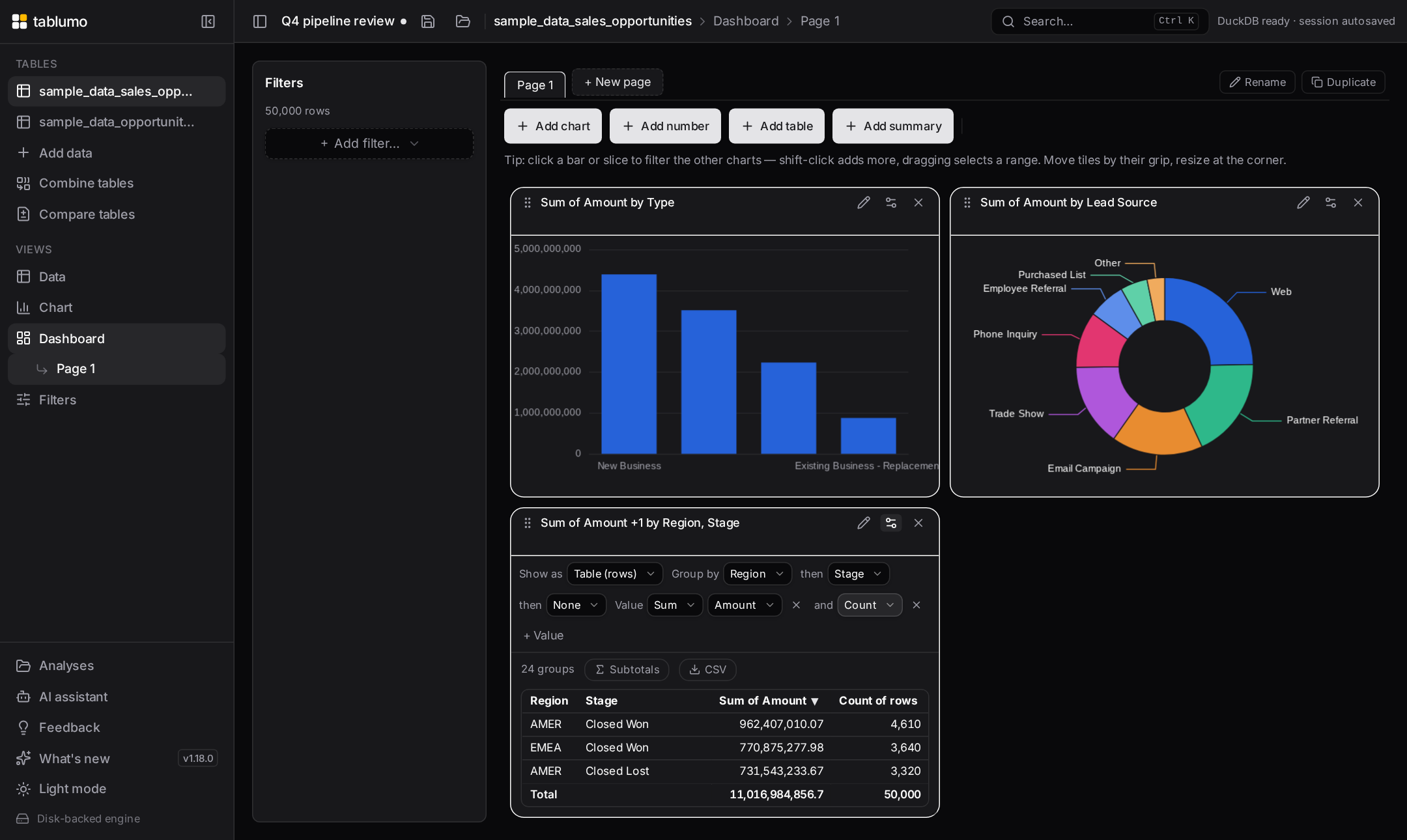
The in-app user manual filled out its remaining visual sections. The Charts area now documents every chart type — box plots, treemaps, funnel and waterfall charts, radial bar, gauge and bullet charts, and Sankey diagrams, heatmaps and 3-D scatter plots — each with when it suits the question and what its options do. A new Dashboards area explains building a dashboard (named pages as tabs, adding chart, KPI, summary, table and note tiles, and arranging them by drag and resize) and working with tiles (rename, reconfigure, enlarge, duplicate, export and remove). And a new Pivot tables area covers grouping rows into a summary (choosing the measure, nesting columns, expanding the records inside a group, and conditional formatting) and cross-tabs (one category down the rows and another across the columns, with honest totals, percentage and running-total views, and a heatmap). Every section is searchable and deep-linkable in both themes.
v2.31.0–v2.35.0 — The user manual learns the chartsJune 14, 2026 · 21:18–21:48 UTC
The in-app user manual now has a Charts area that explains each chart type, when it suits the question you're asking, and what every option does. It opens with choosing a chart and its smart defaults, then dedicated sections for bar, line and area charts (stacking, grouping side-by-side, and filling to 100%), scatter and bubble charts (colour groups, a trend line with its fit strength, and sizing each bubble by a third measure), pie and rose charts, and histograms (binning a column into ranges with a plain-language read of its shape). The manual also gained sections on combining tables and deleting a dataset. More chart types and feature areas land run by run.
v2.26.0–v2.30.0 — A searchable, in-app user manualJune 14, 2026 · 20:24–21:08 UTC
A built-in user manual now lives inside the app — a handbook you search and navigate, reachable from the Help menu or with ⌘K. It documents each feature and its options from a single source, area by area: getting started (importing data, sample datasets, confirming column types and formats), the data grid (reading it, sorting, the column header menu, managing columns), filtering, exploring your data (drilling into the rows behind a value, selecting and marking in charts, cross-filtering a dashboard), calculated columns, the SQL console, and the data-quality scorecard. Every section is searchable by feature name or synonym and deep-linkable, in both themes. More sections land run by run, most-used first.
v2.21.0–v2.25.0 — A tidier navigation sidebar and a streamlined Help menuJune 14, 2026 · 19:25–20:16 UTC
The navigation sidebar now fits the visible window height, so the links at its foot — Analyses, Feedback, What's new, the theme switch and Help — are always reachable without scrolling the page; a long list of tables scrolls on its own inside the sidebar while the bottom controls stay pinned (v2.25.0). Date-range filters now sit fully inside the filter panel instead of spilling past its edge (v2.23.0). The Help menu is a quick reference you open from the sidebar or with ? — a distribution-shape glossary and the keyboard-shortcut list, with ⌘K to search every command (v2.24.0).
v2.18.0 — Safer dataset removalJune 14, 2026 · 18:45 UTC
Removing a dataset became safe and obvious: a visible × on every table and a confirm that first lists what depends on it — the dashboards, combined tables and calculated columns affected — so nothing breaks by surprise.
v2.6.0–v2.10.0 — Hands-on tutorials, broadened — and the engine rebuilt so they actually workJune 14, 2026 · 16:36–17:25 UTC
The tutorials deep-dive widened to charts (open a chart, switch bar → line → pie and learn when each fits, v2.6.0), dashboards (open a board, add a chart tile and a big-number KPI yourself, v2.7.0), import & column types (format a column as currency, then add thousands separators, v2.8.0), and stacking & composition (split one bar chart, then flip it stacked → 100% → grouped to read three different answers, v2.9.0) — each auto-listed in ⌘K and the "?" hub. Then the most important fix: the tutorial engine was rebuilt (v2.10.0). The tutorial overlay no longer sits between you and the app — the real control stays fully clickable, a numbered, pulsing hotspot marks the exact spot, and every step always has a Next button (plus "Show me") so you're never stuck. Doing the real action still advances instantly.
v2.1.0–v2.5.0 — Tutorials you actually do, and sharper distribution readsJune 14, 2026 · 15:28–16:18 UTC
The big post-2.0 thread is a tutorials deep-dive: tours you drive, not slideshows you click through. The new action-gated tour engine (v2.3.0) spotlights a real control, asks you to perform the action, and advances the instant you do it — with a gentle nudge if you click the wrong thing and a "Show me" button so you're never stuck. On it ride three hands-on tutorials so far: "find your way around" (v2.3.0), "Sorting" — click a header to sort, flip the direction, Shift-click for a multi-column sort (v2.4.0), and "Filters" — build a min/max range filter on a number column, a searchable checklist on a text column, learn the "is / is not" exclude switch, then clear everything with Reset all (v2.5.0). Each is auto-listed in ⌘K and the "?" tutorials hub. Alongside, histograms learned to say whether multi-peak splits are balanced, lopsided, or "one minor" and to print each hump's row share (v2.1.0–v2.2.0). More hands-on tutorials — charts, dashboards, data prep — are landing run by run.
v2.0.0 — Tablumo 2.0June 14, 2026 · 15:14 UTC
A milestone, not a single feature. Since 1.0, Tablumo has closed out the high-impact set that defines a credible analysis tool: drag-and-drop import, an instant full-data grid, sort and multi-column live-chip filtering, smart-default charts (bar, line, scatter, bubble, 3-D, box plot, histogram, heatmap, summary table), bar-click drill-down, multi-chart dashboards with cross-filtering, and session restore on reload — all running locally in the browser over your whole dataset, with no upload and no account. This release also marks the guided experience as ready: an in-product tutorial walks a newcomer from import to a cross-filtered dashboard, and a "Reading distribution shapes" glossary in Help explains every at-a-glance cue the charts emit. 2.0 is the honest line under everything proven across the 1.x series. What stays true: zero friction, local-first privacy, sub-200ms interactions on full data, and cues that never overstate what the data shows.
v1.200–v1.204 — Sharper shape cues, and a glossary that explains every one of themJune 14, 2026 · 14:04–14:42 UTC
The distribution-shape vocabulary got both deeper and more discoverable. A two-peaks histogram now pins the dividing point to sub-bin precision — a lopsided dip reads off-centre, a flat trough reads the line between the bars (v1.200). Box plots gained two more plain-language reads: which tail runs longer ("long high tail" / "long low tail" / "even tails", v1.201) and whether a whisker reaches a genuine outlier past the 1.5×IQR fence ("high outliers" / "low outliers" / "outliers both ends", v1.203). Histograms now name three, four, or more peaks, not just two (v1.202). And because all these cues are words you might not know on sight, Help now carries a "Reading distribution shapes" glossary — a one-line definition of every phrase, grouped by box plot vs. histogram, generated from the same source the charts use so it never drifts (v1.204).
v1.195–v1.199 — Your distribution charts now describe their own shape in plain wordsJune 14, 2026 · 13:14–13:51 UTC
Both of Lens's distribution charts learned to read themselves aloud. A box plot tooltip now names its skew — "skews high", "skews low" or "roughly symmetric", from where the median sits in the box (v1.195). A histogram tooltip turned into a percentile readout: each bar adds "<pct> up to here", so where the running total crosses 50% is the median bin (v1.196). And the histogram's x-axis caption now spells out the whole shape at a glance: "right-skewed" / "left-skewed" / "roughly symmetric" (v1.197), or — checked first — "two peaks" when a column is genuinely bimodal, the shape a lone skew label would miss (v1.198). As of v1.199 a two-peak caption even tells you where the groups divide — "Amount (two peaks, split near $50)", the low valley between the humps read in the column's own format — so you know not just that a column splits but where to cut it. All plain-language, display-only, and one hover (or glance) away.
v1.190–v1.194 — Distribution charts read your column formats, and box-plot tooltips now spell out the spreadJune 14, 2026 · 12:30–13:06 UTC
The display-format work reached the last two charts that still showed raw numbers, then the box plot's tooltip grew more useful. Box plots now read your column format on the value axis and in the five-number tooltip — a currency column shows "$50,000", a rate "12%" (v1.190) — and so do histograms, on their bin axis labels and tooltip ranges (v1.191) and on the headers you see when you drill into a bin (v1.192). Then the box-plot tooltip started writing out the numbers the glyph is built to show but never spelled: the IQR (Q3 − Q1, the box height — the middle-50% spread) (v1.193), and now the range (Max − Min, the full whisker-to-whisker span) beside it, so the footer reads "IQR · range · values" (v1.194). Side by side they tell a tight cluster with far outliers apart from a broadly-spread category at a glance — both in your column's chosen format, all display-only, the underlying maths untouched.
v1.185–v1.189 — Column formats reach every last surface, then become one-click to apply and undo across the whole tableJune 14, 2026 · 11:32–12:18 UTC
The per-column display formats finished their journey and grew batch controls. Percent and plain-number formats now read through on scatter, bubble and 3-D plots — axes and point tooltips (v1.185) — and on the aggregation heatmap and summary-table legends, so a rate heatmap's colour key and a "> 80%" highlight caption read "%" instead of "0.8" (v1.186). A scatter trend line's tooltip now speaks your Y-axis format too: slope reads "$1,235" / "6.0%" with a "Δy per x" label and the intercept ("y at x=0") is surfaced in the same shape (v1.187). Then the repetitive part went away: format one numeric column the way you like and "Apply to all number columns" stamps it onto every numeric column in one click (v1.188), while "Reset formats on all number columns" clears every currency, percent and plain-number display across the table in one click — the symmetric undo (v1.189). Both are display-only and leave widths, labels and order untouched.
v1.180–v1.184 — Per-column display formats: currency, percent and plain-number shapes that read through everywhereJune 14, 2026 · 10:26–11:24 UTC
You can now tell a column how to read, and that choice follows the column wherever it appears. Right-click a numeric header to show it as a percentage — multiply a ratio (0.23 → 23%) or just append the sign (23 → 23%), at the decimals you want (v1.180) — and that percentage now also reads on charts: axes, tooltips, value labels and KPI tiles all show "23%" instead of "0.23" (v1.181). A plain-number format joined it for the literal "#.##" case — thousands separators (1,234,568), fixed decimals (1234.50), or compact shorthand (1.23M) — in the grid and totals footer (v1.182), then carried onto chart tooltips and KPI hovers too (v1.183). And now all three formats — currency, percent and plain-number — follow into the dashboard's pivot and grouped summary tables, so a Sum-of-Revenue cell reads "$1.2M" and an average rate reads "23%" instead of a stock number (v1.184). Throughout, formatting is display-only — your underlying values, filters, sorts and exports are untouched, the exact value is always one hover away, and a column is money, a percentage, or a plain number, never two at once.
v1.174–v1.179 — A full onboarding system: a tutorials library, a start-screen gallery, a persistent Help hub, a "?" hotkey, and a shortcuts cheat sheetJune 14, 2026 · 09:18–10:06 UTC
The guided tour grew into a whole learning system. A library of bite-size feature tutorials joined the main walkthrough — short, focused tours for Charts, Filters & cross-filtering, and Combine & compare, each launchable on demand and spotlighting the real controls (v1.174). They became mouse-discoverable on the start screen as a "Learn more" card grid right under the sample datasets, so you don't have to know the ⌘K shortcut to find them (v1.175). Once you load data the tours used to vanish; now the sidebar's "Help & tutorials" hub keeps every tutorial one click away at any time — the main "Get started" walkthrough featured up top, every feature tour below, also openable by typing "help" in ⌘K (v1.176). The flagship dashboard feature got its own "Build a dashboard" tour — open the canvas, drop a tile, click a bar to cross-filter every tile, save the board — auto-listed everywhere the others are (v1.177). A bare "?" keystroke now opens the Help hub from anywhere, the same convention as GitHub, Linear and Slack, with a discoverable "?" hint on the sidebar button (v1.178). And the hub now ends with a keyboard-shortcuts cheat sheet — ⌘K, "?", Esc — with platform-aware key chips, so the global keys are written down in one honest place (v1.179).
v1.168–v1.173 — Charts that explain themselves, bullet charts, period-over-period pivots, a guided tour, and one-keystroke filter clearingJune 14, 2026 · 08:13–09:05 UTC
A big stretch across reading, charting and onboarding. Charts now spell out their own key findings: a short, plain-language strip under the chart calls out the biggest category, the notable mover and the overall shape — computed straight from the plotted data, never invented (v1.168). A new Bullet chart lays your categories out as slim bars each measured against one shared target, with honest poor/satisfactory/good bands behind them, so "on track vs behind" reads in one pass (v1.169). The pivot cross-tab learned period-over-period reading: "Change vs previous" and "% change vs previous" re-express each cell as how it moved from the column to its left, with signed gains and heatmap shading — and honest blanks at the edges instead of fake zeros (v1.170). The 3D scatter gained a "Size by" picker so every sphere can encode a fourth measure, area-mapped so a sphere that looks twice as big really is (v1.171). New users get a built-in guided tour — a friendly, dismissible interactive walkthrough that spotlights one real control at a time (data → filters → chart → dashboard → ⌘K → save), launchable any time from the sidebar or ⌘K (v1.172). And the ⌘K palette now offers "Clear all filters" with a live count, so you can jump back to the full dataset in one keystroke — shown only while something is actually filtered (v1.173).
v1.163–v1.167 — Preview and pick columns when you combine tables; Pareto and 100%-stacked area chartsJune 14, 2026 · 06:54–07:40 UTC
Combining two tables got two big steps toward a real data model. You now see a live preview of the first rows of the combined result — with a "+ N more rows" note — before you click Create, so you can check the shape and the new columns instead of materializing blind (v1.163). And a "Columns to bring in" chip panel lets you choose exactly which columns the second table contributes: keep them all or untick the ones you don't need, with a "5 of 8 columns" summary and Select all / Clear — and the choice is saved with the combine recipe, so a later Refresh rebuilds the same lean table (v1.164). On the charting side, the "Stack as %" toggle now reaches area charts: split an area by a colour column and tick it to get the classic 100%-stacked area, reading how the mix shifts over time (v1.165). And bar charts gained the Pareto view — tick "Pareto" and the bars sort largest-first with the running cumulative percentage drawn as a line on a 0–100% right axis and a dashed 80% guide, the classic 80/20 read (v1.166). The Pareto now also highlights the "vital few": the handful of bars that make up the first 80% keep their full colour while the trailing "trivial many" fade back, so the split you care about reads straight off the bars (v1.167).
v1.158–v1.162 — Pivot your data into a cross-tab, then shade it like a heatmapJune 14, 2026 · 05:53–06:42 UTC
Group the Data view by two columns and a new "Rows ⇄ Pivot" toggle turns it into a true cross-tab: the first column runs down the rows, the second across the top, your measure in every cell, with honest Total column, row and grand total — each computed over all the underlying rows, never just summed from the cells, so an average total is the real average and a blank cell means "no rows here," never a fake zero. Click any cell to filter the whole page to that row × column (v1.159). A "Show values as" menu re-reads every cell as a percentage of the grand total, its row, or its column — so a region × quarter grid instantly shows how each region's year splits, or who owns each quarter (v1.160) — or as a running total across the columns, turning each row into a year-to-date line (v1.161). And a Heatmap toggle tints the body cells faint-to-strong by value, so the hot and cold spots jump out at a glance — the same honest, single-hue colour scale the summary tables already use (v1.162). Separately, tiny non-zero numbers that used to round to a flat "0" on KPI tiles and chart axes now read "<0.01", so you can tell a real small value from a true zero (v1.158).
v1.153–v1.157 — Saved filter views, a smarter value picker, and the share that survivesJune 14, 2026 · 04:55–05:40 UTC
The Filters panel got a week's worth of polish. Filter presets / saved views let you build a filter stack, save it under a name, and re-apply it as a one-click bookmark chip — the questions you ask every week are now one click away, remembered between sessions and offered on whatever file you open; a preset quietly skips any column the new table doesn't have (v1.153). The categorical value picker gained the affordances Excel and Tableau filter dropdowns ship: hover a value for "only" to keep just it, the "invert" button to flip the whole selection at once, and — once you've typed a search — "select matching" to tick every match in one go (v1.154–v1.156). And the row count above every view now ends with the share that survives your filters — "12,500 of 50,000 rows (25%)" — an honest read that never shows 0% while a row is kept or 100% while one is dropped, so you can feel at a glance whether you've narrowed to a sliver or barely trimmed (v1.157).
v1.148–v1.152 — The Data Quality scorecard learns to read your data's intentJune 14, 2026 · 03:56–04:38 UTC
Five new per-column tells join the ⌘K Data quality scorecard, each a calm note that never changes your score — it now reads what a column means, not just its stats. Extreme values flags a number sitting far out from the rest (about six standard deviations or more from the average) — a fat-fingered 9,999 or a stray negative that quietly drags every average — and points you at a range filter (v1.148). Many values fills the gap between "Good for grouping" and "All unique": a column with hundreds of distinct values is too granular to chart by directly, so it suggests a top-N view (v1.149). Spans tells you at a glance how much calendar time a date column covers — "Spans 3 years", "Spans 6 months" — with the exact first and last dates in the tooltip (v1.150). Wide value range spots a numeric column whose values run across a thousandfold or more (a few thousand to a few million) and suggests the log scale that reads it better (v1.151). And Percentage — the first tell that reads a column's meaning — recognises a column named like a percent ("Probability (%)") whose values stay within 0–100, and reminds you it's a rate: average it, don't sum it (v1.152). Every one reuses the numbers already measured in the single profiling pass, so the scorecard stays instant on millions of rows.
v1.143–v1.147 — Text notes on dashboards, and a faster way to pick columnsJune 14, 2026 · 03:00–03:42 UTC
Dashboards gain a Text / note tile — an annotation that holds a small Markdown note (a title over a group of charts, a sentence of context, a link to the source) rather than data, added with one click and saved with the board (v1.143). And the Columns picker over the data grid got four tools for taming a wide table: a row of type chips (Text / Number / Date / Boolean) to show only columns of a type (v1.144); a "Show only these N" shortcut that collapses the table to just the columns you've narrowed to (v1.145); a "type:" search so you can type type:number right in the box (v1.146); and its mirror, "Hide these N," to sweep a whole group of columns out of sight in one click (v1.147). All four are purely visual — your data, filters, charts and exports still see every column, and "show all" brings them back.
v1.140–v1.142 — Find in data: scope to a column, match case, peel off a termJune 14, 2026 · 02:25–02:45 UTC
Three refinements to the "Find in data…" box. A column picker narrows the search to a single column instead of every one — the difference between "rows that mention West anywhere" and "rows whose Region is West" (v1.140). An "Aa" toggle makes the search case-sensitive when case carries meaning — product codes, currency symbols, an acronym vs an ordinary word — off by default so the common search is unchanged (v1.141). And the little include/exclude chips that show how your query was read are now clickable to remove: each carries a small ×, so after typing west enterprise -test you can drop just -test without re-editing the line, narrowing one condition at a time (v1.142). All three fold into the same one filter, so the row count, totals, charts and export follow along.
v1.138–v1.139 — The ±SD spread band reaches dashboard tiles — and picks its widthJune 14, 2026 · 02:06–02:15 UTC
The one-click standard-deviation band — a zone shaded a fixed number of standard deviations either side of the mean, computed live from the plotted values — now works on bar/line/area dashboard tiles, not just the chart builder, and is saved with the board (v1.138). And it gained a width selector: pick ±1, ±2 or ±3 SD on either surface and the shaded zone stretches that far, recaptioned "Mean ±2 SD" to match — so you can frame "the usual range" tightly or loosely as the data calls for (v1.139).
v1.135–v1.137 — Find in data: search every column, then refine itJune 14, 2026 · 01:35–01:54 UTC
The Data grid gains a "Find in data…" box. Type any text and the table instantly narrows to the rows where it appears in any column — a name, a city, a stage, a number, a date — and the matching cell is highlighted so your eye lands on it; no need to know which column holds the value (v1.135). Because the search rides on the same one filter as everything else, the row count, totals, charts, dashboards and CSV export all follow it, and clearing the box (or Esc) brings everything back. It's also a power search: several words are combined with AND (west enterprise finds rows with both), "quoted phrases" stay together, and a leading minus excludes a word (enterprise -west) (v1.136). And it now echoes how it read your query as small include/exclude chips beside the box, so a multi-term search is easy to confirm at a glance (v1.137).
v1.133–v1.134 — Colour by rule: green / amber / red on KPIs and tablesJune 14, 2026 · 01:02–01:17 UTC
Status at a glance, two ways. A KPI single-number tile can turn its big number green, amber or red by a rule — set a Good value and a Bad value and the colour follows, with the direction (higher-is-better vs lower-is-better) inferred from the two numbers, saved with the board (v1.133). And the grouped/summary table gains a "Highlight rule" button beside Data bars and Color scale: set a Green-at and a Red-at cutoff and every numeric cell turns green/amber/red by where it falls — an absolute, Excel-style highlight-cells rule with a key under the table (v1.134). Both are display-only and fully reversible.
v1.132.0 — Shade a "±1 SD" spread band with one clickJune 14, 2026 · 00:48 UTC
The chart builder's "Ref. lines" menu gains a "±1 SD band" toggle. Switch it on and the chart shades a zone one standard deviation either side of the mean of the bars you're looking at — a one-click read of how spread out the categories are, and which sit outside the usual range. Unlike the typed Band, you enter no numbers: the zone is computed from the plotted values and labelled "Mean ±1 SD", so it tracks your filters and Top-N live and always brackets the Average reference line. Display-only and reversible with the same click; it draws on a single bar, line or area chart, and stays out of the way on split (colour-by) charts where one spread across several series wouldn't mean much.
v1.130–v1.131 — Shade a target zone, on charts and dashboard tilesJune 14, 2026 · 00:25–00:36 UTC
Reference lines mark a single value; sometimes the story is a range. A new Band from / Band to pair in the "Ref. lines" menu shades a horizontal target zone behind the bars, line or area — type a low and a high value (the same 40k / 1.2m shorthand as the Goal box) and the chart marks "Target 40K–60K" (money when the measure is a currency), reading at a glance whether each category sits inside the range or pokes out. The value axis grows so a band above the tallest bar never clips, and a horizontal bar re-keys the zone to a vertical strip. It started in the chart builder (v1.130) and now works on bar/line/area dashboard tiles too (v1.131), saved with the board and restored on reload. Display-only; works on single and split charts; a 100%-stacked chart hides it.
v1.128–v1.129 — Sort a chart's categories A → Z, in the builder and on tilesJune 14, 2026 · 00:00–00:12 UTC
Alongside largest-first and smallest-first, charts can now order their categories alphabetically. A new sort control in the chart builder (v1.128) offers A → Z order — handy when you want a stable, predictable layout rather than one that re-ranks every time the numbers move — and the same per-tile Sort choice now lives on bar/line/area/pie/rose dashboard tiles (v1.129), saved with the board. Time-bucketed charts always read in date order and ignore the setting. Purely a display choice — your data, filters and Top-N are untouched.
v1.123.0 — Renamed columns read the same in the chart builder and filtersJune 13, 2026 · 23:08 UTC
A renamed column's friendly name now follows it into every chart-builder picker and the filter sidebar — the add-filter dropdown and each active filter card — so you no longer see "Revenue" in the grid but "amt_usd" everywhere else. Purely cosmetic: the chart query, sort, SQL console and exports all keep the real column name, with it kept in the filter card's tooltip.
v1.122.0 — Rename a column to a friendlier nameJune 13, 2026 · 22:52 UTC
Right-click any column header and pick "Rename column…" to give it a clearer display name — show "Revenue" instead of "amt_usd". The new name appears straight away, with the real column name kept beside it so you always know what's underneath. It's purely cosmetic: filters, sorts, the SQL console, charts and exports all keep using the real name, so renaming is completely safe and reversible, and it travels with your saved session.
v1.121.0 — Paste a table straight from the clipboardJune 13, 2026 · 22:38 UTC
Copy a block of cells in Excel, Google Sheets or an email, switch to Tablumo, and press ⌘V (Ctrl+V on Windows) — or click the new "Paste data" button on the start screen. The copied data lands as a new table instantly, through the very same importer as a dropped file, so the delimiter, header row and column types are detected for you. It understands both spreadsheet (tab-separated) and CSV text, works whether or not you already have data open, and stays out of the way when you paste into a text field.
v1.120.0 — Combine bars and a line in one chartJune 13, 2026 · 22:30 UTC
A new "+ Line" control overlays a second measure on a bar chart as a line drawn on its own right-hand axis, with a legend naming both — read, say, the count of deals as bars and the average deal size as a line at the same time, each on the scale that suits it. Pick the line's aggregation independently of the bars'.
v1.119.0 — Stack split bars as 100% to compare their mixJune 13, 2026 · 22:18 UTC
A "Stack as %" toggle makes every colour-split bar fill to 100%, with the axis and tooltip reading in percent, so you compare each category's composition rather than its total — which region's revenue leans most on enterprise, say. The absolute stack and side-by-side modes are still a click away.
v1.118.0 — Bars split by colour can now sit side by sideJune 13, 2026 · 22:06 UTC
A "Grouped" toggle on a colour-split bar chart makes the segments sit side by side instead of stacking — the classic grouped bar chart for comparing values within each category at a glance. Reference and goal lines follow along, landing on the tallest single bar.
v1.117.0 — Coefficient of variation now reads as a percentageJune 13, 2026 · 21:59 UTC
Charts built with the "Coeff. of variation" aggregation now show their values as percentages: a category whose measure varies by 0.43 reads 43% on the axis, in the tooltip and on the data labels, instead of a bare ratio. The coefficient of variation is standard deviation ÷ average — a unitless number conventionally reported as a percent — so dispersion is far quicker to read and compare across categories. Small spreads keep one decimal (4.2%); larger ones round to whole percents. Applies to bar, line and area charts.
v1.113–v1.116 — Consistent colors: a value keeps the same hue everywhereJune 13, 2026 · 21:22–21:48 UTC
A new "Consistent colors" toggle ties every value to its own fixed colour, derived from the value's name rather than its position in the chart. Switch it on and "Closed Lost" is the same hue whether it's the first or fifth series, keeps that colour after other values are filtered out or the ranking re-sorts, and lands on the same colour across different charts — so your eye tracks a category by colour alone. It started on split (colour-by) and pie/rose charts (v1.113) and now reaches treemaps (v1.114), funnels (v1.115) and radial bars (v1.116). Off by default; cross-filter highlighting still dims the values you didn't click while leaving their fixed colours intact.
v1.112.0 — Export to Excel straight from the ⌘K command paletteJune 13, 2026 · 21:08 UTC
The command palette (⌘K / Ctrl-K) now has an "Export Excel" action right next to "Export CSV". Open it, type "excel" or "xlsx", and the table you're looking at downloads as a real .xlsx workbook — the keyboard-first twin of the sidebar Excel export. The file is identical: one sheet named after your table, with the same filters, excluded rows and sort order you currently see, and every matching row included. Both export actions appear only once a table is loaded, and both honour the active view exactly — so whichever route you take, you get the same numbers.
v1.111.0 — Bar charts can now lie down: horizontal orientationJune 13, 2026 · 21:00 UTC
Bar charts gain a "Horizontal" toggle. Switch it on and the bars lie on their side — the category names run down the left edge instead of along the bottom, so long labels (product names, regions, account names) read straight across without tilting or truncating. The largest bar sits at the top, the order most people scan a ranking, and the value axis moves to the bottom. Everything keeps working in the new orientation: click a bar to drill in, drag to box-select a band of categories, and reference or goal lines re-draw as vertical guides. Data labels, currency formatting and the log-scale toggle all follow along. Off by default; stacked/"split" bars and dashboard tiles stay vertical for now.
v1.110.0 — Export any table straight to Excel (.xlsx)June 13, 2026 · 20:48 UTC
Every table now offers "Export as Excel (.xlsx)" right beside "Export as CSV" in its sidebar menu. You get a real .xlsx workbook that opens straight into Excel, Numbers or Google Sheets with the columns already on a single sheet named after your table — no import-and-guess step, and numbers come through numeric so totals and formulas work on open. The export honours exactly what you see: the same filters, excluded rows and sort order, with every matching row included (not just the visible page).
v1.109.0 — Log scale: stop a few giant bars from flattening the restJune 13, 2026 · 20:38 UTC
Bar, line and area charts get a "Log scale" toggle next to "Values": switch it on and the value axis goes logarithmic, so a handful of huge values no longer squash everything else onto the baseline and orders-of-magnitude differences become readable. It stays honest — a log axis only makes sense for strictly positive data, so if any value is zero or negative the chart keeps the linear axis and says why ("Log scale needs every value above zero — showing linear") instead of silently dropping bars. Off by default; drill-down and cross-filter are untouched.
v1.108.0 — Pie and rose slices can show value and % shareJune 13, 2026 · 20:24 UTC
The existing "Values" toggle now reaches pie and rose charts: switch it on and each slice prints its name with the value and its percentage of the whole — "EMEA 1.2M (38%)" — so you can read the split off the chart instead of hovering each wedge. The labels are compact and currency-aware, matching the rest of Tablumo, and stay out of the way on compact dashboard tiles. Off by default.
v1.107.0 — Date-range filter chips now read as plain calendar periodsJune 13, 2026 · 20:14 UTC
A date filter that covers a whole calendar period now names that period on its chip instead of spelling out both dates: a full month reads "Close Date: Jun 2026" rather than "2026-06-01 – 2026-06-30", a quarter reads "2026 Q2", a half "2026 H1", and a year just "2026" — the same wording you already see on bucketed chart labels. Only the chip face is shortened; the exact dates stay in its hover tooltip, its right-click menu, and the sidebar editor, so nothing precise is lost. Partial spans, single days, and timestamp columns keep their exact range, and the friendly label appears only on a clean whole-period match.
v1.106.0 — The range filter now spells out the exact window you selectedJune 13, 2026 · 20:03 UTC
When you narrow a numeric range filter, the caption under the slider now leads with the actual window you've landed on — "€1.5M–€3M · 50% of the range" — not just the percentage. After you let go of a handle the live drag bubble disappears, so previously your chosen bounds only lived in the two small number boxes; now the slider itself states the window in the same compact, currency-aware shorthand, followed by how much of the column's span it keeps. It stays hidden until you've narrowed things, and collapses to a single value when both ends round alike.
v1.105.0 — A numeric range filter now tells you how much of the data it keepsJune 13, 2026 · 19:56 UTC
Narrow a numeric range filter — drag a handle in or type a bound — and a small caption now appears under the track reading "Showing 50% of the range", so you can see at a glance how aggressively you've cut the column: barely trimmed, or down to a thin sliver. It's measured against the column's full span, stays hidden at the default "any" state, and keeps a decimal on very thin slices so it never misleadingly rounds to 0%.
v1.104.0 — The range-filter slider now shows a min / mid / max scaleJune 13, 2026 · 19:50 UTC
The drag slider's track now carries a small reference scale underneath — the column's lowest value on the left, midpoint in the centre, highest on the right — so before grabbing a handle you can see what the track spans and where the middle sits. The three labels read just like the live drag bubble: compact and currency-aware, so a money column shows "€0 / €1.5M / €3M". Muted and out of the way, and absent for a constant column with nothing to drag.
v1.103.0 — The range-filter value bubble stays in view at the track endsJune 13, 2026 · 19:41 UTC
The live value bubble above a dragged range-filter handle is now edge-aware: centred over the handle through the middle of the track, it pivots its anchor near each end — left-aligning at the start, right-aligning at the finish — so the value stays fully in view wherever you land instead of clipping past the panel edge at the extremes. A small polish that makes the bound you're setting always readable.
v1.102.0 — Typed filter bounds now read the same way as dragged onesJune 13, 2026 · 19:34 UTC
Type a min or max into a numeric range filter and a small compact echo now appears just beneath the box — "1.23M", "€500" — so a bound you type reads exactly like one you drag, where the same value already floats above the slider handle. No more squinting at a long string of zeros to check you typed "1230000" and not "123000". The echo is currency-aware and stays quiet when it has nothing to add: a plain small number like "500" shows no echo, a large number abbreviates, and a currency column always confirms its symbol. The min echo sits under the min box, the max under the max, mirroring the inputs above.
v1.101.0 — The range-filter slider now shows the value you're landing onJune 13, 2026 · 19:22 UTC
Drag either handle of a numeric range filter and a small bubble now floats above it with the live value — "1.23M", "€450K" — so you can see exactly where you're setting the bound without glancing down at the number boxes. It follows the handle as you drag, and shows up the same way when you nudge a handle with the arrow keys. The value is formatted just like the rest of the filter: compact, and in the column's currency when it has one. It appears only while you're holding (or focused on) a handle and tucks away the moment you let go, so the slider stays clean at rest.
v1.100.0 — The Data Quality scorecard now points out your best columns to group byJune 13, 2026 · 19:15 UTC
Run the ⌘K Data quality scorecard and a column made of a small set of repeating values — Region, Status, Segment, a rating — now earns a green "Good for grouping (5)" note, telling you straight away which columns make a natural category to break a chart down by. It's the encouraging counterpart to the "All unique" tell: where that warns a column is really an identifier, this points you at the dimensions worth grouping on. Read straight from the counts already measured, it never changes the score and only fires when there are genuinely few categories each repeating across many rows.
v1.99.0 — The Data Quality check now spots when an average is misleadingJune 13, 2026 · 19:09 UTC
The ⌘K Data quality scorecard now flags a heavily-skewed numeric column with a calm "Right-skewed" or "Left-skewed" note — when the mean sits near one end of the range, a handful of much larger (or smaller) values are dragging the average away from typical, so the median is the more honest summary (which Lens already offers). It's read from the min/max/mean already measured, never docks the score (skew is the shape of the data, not a defect), and only fires on a real numeric column with enough rows and variety.
v1.98.0 — Column dropdowns now explain the "(7)" next to each nameJune 13, 2026 · 18:57 UTC
Every column picker has carried a distinct-count badge next to each name — "Stage (7)", "Opportunity ID (50,000)". Now hovering an option spells it out — "7 distinct values in this column" — teaching the convention once without the visible label ever getting longer. A constant column reads "Only 1 distinct value in this column", and a column whose count was never measured shows no tooltip at all, so nothing is ever guessed.
v1.97.0 — A heads-up when "Mode" lands on a column with no real most-frequent valueJune 13, 2026 · 18:46 UTC
Pick the Mode aggregation — the most frequent value — for a chart measure that's almost entirely distinct, like a transaction amount or an ID-like number, and a calm note now appears under the measure picker: "… has almost all distinct values, so 'most frequent' just returns its smallest — Mode is meaningful on a column with repeated values." On a column where nearly every row differs there's no honest "most frequent": every value is tied at a single occurrence, so Mode quietly returns the smallest, which reads like a real answer but isn't. Mode still computes and the value still shows — the note just explains why it's suspect. It only fires when Mode is chosen and the column is at least 90% unique (never on tiny tables), so a column with healthy repetition — a quantity, a category code, a rating — is left alone.
v1.96.0 — A plain scatter now shows its trend strength under the chartJune 13, 2026 · 18:36 UTC
Turn on the trend line for an ordinary scatter (no Colour-by) and a quiet caption now appears under the chart — "Trend: R²=0.62 · Moderate". A coloured scatter already shows this in its legend, one entry per group; but a plain scatter has no legend, so until now the fit lived only on the dashed line's cramped end-label, which the cloud of points can sit right on top of. The caption surfaces it where it's always legible, reading identically to the line's own label. A genuinely weak fit (R² below 0.1) still gets the warmer "points barely follow this line" caveat instead — never both at once, so a near-random cloud is never dressed up as a real relationship.
v1.95.0 — The scatter legend now says how strong each group's trend isJune 13, 2026 · 18:27 UTC
On a colour-by'd scatter with the trend line on, each colour group's legend entry already showed its R²; now it also carries the plain-English strength word — "EMEA · R²=0.71 · Strong", "APAC · R²=0.04 · Weak" — so which group's relationship is tight versus barely-there reads at a glance, without hovering a dashed line. The legend text reuses the same label as the line itself, so the two can never disagree, and groups with no fitted line keep just their bare name, claiming no strength they don't have.
v1.94.0 — Colour scale gets a diverging, two-hue modeJune 13, 2026 · 18:23 UTC
With Color scale on, a new Diverging toggle splits a column at a neutral pivot and tints the two sides in two hues — below the pivot in red, above it in the accent colour, the centre left clear — so cells below versus above the line are instantly distinguishable, not just paler or darker on one ramp. When a column spans zero the split sits exactly at zero (losses versus gains); otherwise at the range midpoint, with each side scaled to its own extreme and the key naming the pivot. The plain single-hue scale stays the default; diverging is opt-in, for columns that genuinely have a neutral point.
v1.93.0 — The colour-scale key now shows your real low and high numbersJune 13, 2026 · 18:11 UTC
When Color scale is on and a single column is shaded, the legend under the toolbar now shows that column's actual minimum and maximum values — the real numbers, formatted exactly like the cells, currency and all — in place of the generic "Low" / "High", turning the gradient into a true quantitative key. Because the scale tints each column on its own range, a single value pair can't honestly describe several shaded columns at once, so with more than one colourable column the legend stays the qualitative "Low → High".
v1.92.0 — The colour scale gets a legend, so the shading has a keyJune 13, 2026 · 17:59 UTC
Turn on Color scale in the summary table and a small key now appears under the toolbar — a Low → High gradient swatch in the same shade the cells use. Until now the heatmap fill tinted your cells with no caption, so a first-time reader saw colour but had to guess what it meant. The legend says it plainly: the tint encodes magnitude only — pale where a column is low, strong where it's high — with no green-good / red-bad judgement, because the data alone never says whether high is good or bad. The swatch is built from the exact same tints the cells get, so the key can never drift from the shading, and it re-colours itself with the theme. Data bars need no key — a bar's length already reads as its value — so the legend shows only for the colour scale.
v1.91.0 — Data bars and colour scale now reach the subtotal rowsJune 13, 2026 · 17:46 UTC
Switch on Data bars or Color scale and the summary table's subtotal rows now get the same treatment as the group rows above them — a bar behind each subtotal, or a heat tint across the subtotals — so you can compare your first-column blocks (each Region, each Year) at a glance, not just the leaf rows within them. The subtotals are scaled on their own range, separate from the leaf rows, because a block subtotal is a much bigger number than a single group. Honest by construction: a single visible block has nothing to compare against, so its colour scale stays plain, and the grand-total row at the bottom is left untinted because one value has no range to shade.
v1.90.0 — Colour scale: shade the summary table to find hot and cold spotsJune 13, 2026 · 17:36 UTC
A new Color scale toggle joins Data bars in the summary-table toolbar. Switch it on and every numeric cell is tinted by where its value falls in its column's range — faint at the column's lowest value, strongest at its highest — so a grid of regional totals or monthly counts turns into a heatmap where the biggest and smallest numbers light up at a glance. It's off by default, and turning it on switches Data bars off (and vice-versa). The shading is a single-hue intensity ramp, not a green-good / red-bad diverging scale: the data alone never says whether high is good or bad, so the colour encodes magnitude only. Blank cells stay clear and a column where every value is identical is left plain.
v1.89.0 — Data bars: see magnitude at a glance in the summary tableJune 13, 2026 · 17:25 UTC
A new Data bars toggle in the summary table draws a small horizontal bar behind each numeric cell, sized to its value — the at-a-glance conditional formatting from Excel and Power BI. The scale is honest by construction: each column gets its own zero-anchored bar scale, so an all-positive column's bars grow from the left edge (never min-stretched, which would exaggerate small gaps) and a mixed-sign column gets a zero baseline with positive bars growing right and negative bars growing left in a softer red. Blank cells and exact zeros draw no bar, and the colours adapt to both light and dark themes. Off by default.
v1.88.0 — Variance and CV join the aggregation menuJune 13, 2026 · 17:14 UTC
Two more ways to measure spread join the aggregation menu everywhere it appears — the chart measure dropdown, every grouped-table column and the totals footer: Variance (the absolute spread of a column) and CV, the coefficient of variation (the spread relative to the average, so you can compare how variable two columns are even when they're on very different scales). Both are honest about units — variance's units would be squared and CV is unitless, so neither carries a currency symbol — and both are numeric-only and remembered with your saved view. CV guards against divide-by-zero on an all-zero column.
v1.87.0 — Mode joins the aggregation menu: the most frequent valueJune 13, 2026 · 16:58 UTC
Wherever you choose Sum, Average, Median or a percentile — the chart's measure dropdown, every grouped-table column and the right-click totals footer under the Data grid — you can now pick Mode, the single most frequent value. It answers a different question than the average: the list price that almost every order actually used, the quantity most line items sell in, the rating that recurs most. Mode is a real value drawn straight from the column, never an invented one, so it keeps the column's currency and number format like the other statistics; it's offered on numeric columns only and remembered with your saved view. With this the aggregation menu reaches twelve summaries everywhere it appears.
v1.86.0 — Median, percentiles and spread reach the totals footerJune 13, 2026 · 16:48 UTC
The totals row pinned under the Data grid now offers the same statistical summaries the charts and grouped columns got: right-click any numeric column's footer cell and, alongside Sum, Average, Min, Max and Count distinct, pin its Median, 25th / 75th / 90th percentile, or sample Std dev — so the bottom of your table can read the typical deal (robust to a few whales), the top-tail order value, or how spread-out the column is, without leaving the grid or writing a formula. Each keeps the column's currency and the same "€1.2M / 45K" shorthand, on numeric columns only, travelling with your saved view.
v1.85.0 — Five new ways to summarize a number: median, spread and percentilesJune 13, 2026 · 16:40 UTC
The aggregation menu — on charts and on every grouped-table column — gains five statistical summaries alongside Sum, Average, Min, Max and the counts: Median, Std dev, and the 25th, 75th and 90th percentiles. So you can chart the median deal size per region instead of an average a few whale deals quietly inflate, see how spread-out each rep's deals are, or read the 90th-percentile order value to understand your top tail — all from the dropdown you already use, no formula. Each stays honest about units: the median, spread and percentiles of a revenue column are still in that currency. Numeric columns only, remembered with the view.
v1.84.0 — Print the values right on your bar and line chartsJune 13, 2026 · 16:31 UTC
Bar, line and area charts get a "Values" toggle in the Chart view: switch it on and every bar prints its number just above it, every line and area point its value alongside — so you can read exact figures off the chart instead of glancing to the axis. Off by default (a busy chart reads cleaner), the labels match the axis exactly: compact and currency-aware ("€1.2M" / "45K"), never long raw digits, and they stay out of the way on compact dashboard tiles.
v1.83.0 — Drag a slider to set a numeric filter rangeJune 13, 2026 · 16:21 UTC
Numeric filters gain a dual-handle range slider above the min/max boxes, spanning the column's real data range: drag the two handles to sweep a range without typing a thing, and the boxes update live as you go (typing still works exactly as before). Pull a handle all the way to its end and that bound clears to "any", so the filter never silently pins to the exact min or max, and the handles can't cross each other. Keyboard- and pointer-accessible, on numeric columns to start.
v1.82.0 — See which group's trend is tightest, right in the legendJune 13, 2026 · 16:08 UTC
Colour a scatter plot by a category and turn on the trend line, and Tablumo fits a separate line through each group. Now the legend tells you how good each fit is — every entry reads its own R²: "EMEA · R²=0.71", "APAC · R²=0.04" — so you can compare at a glance which category's relationship actually holds and which is just noise, without hovering over every dashed line. Groups with no fitted line (the "(other)" roll-up, or any group too sparse to fit) keep their plain name; turn the trend line off and the legend goes back to plain category names.
v1.81.0 — Split charts now label their X axis tooJune 13, 2026 · 15:58 UTC
When you colour a bar, line or area chart by a second column — splitting it into stacked segments or one line per series — the category axis along the bottom now carries its own title: the name of the column you grouped by. Previously only the simple, single-series charts named their X axis. The title sits in its own band above the legend so the two never collide, and stays out of the way on compact dashboard tiles.
v1.80.0 — Set the angle of your chart's X-axis labelsJune 13, 2026 · 15:47 UTC
Bar, line and area charts get an "X labels" control in the Chart view. Tablumo still rotates crowded category labels automatically, but now you can pin the angle yourself: keep them Horizontal when names are short, stand them Vertical to pack more bars in, or set a clean 45° Angled — for when the auto-rotation guesses wrong. Auto stays the default, so nothing moves unless you reach for it.
v1.79.0 — Search your active filters when the list gets longJune 13, 2026 · 15:36 UTC
When the Filters panel holds more than six active filters, a search box appears above the cards: type part of a column name and the visible cards narrow to the matches, with a live "2 of 9 shown · the rest stay active" count and a one-click ×. Searching is purely visual — the hidden filters stay active and the matching-row count is unaffected, spelled out so there's no doubt a filter was dropped.
v1.78.0 — Bar and line charts label the column you grouped byJune 13, 2026 · 15:27 UTC
A bar, line or area chart in the Chart view now shows the group-by column as a title centered under the X axis — "Region", "Stage", "Close Date" — so a chart reads on its own without remembering what the bars stand for. The value axis already carried its "Sum of Amount" title; this brings the categorical axis to the same self-documenting standard. Dashboard tiles stay deliberately clean.
v1.77.0 — Find a column to show or hide by typing its nameJune 13, 2026 · 15:13 UTC
On a wide table the Columns picker now has a search box at the top: start typing and the show/hide list narrows to just the columns whose name matches, with a live "8 of 30 columns" count and a one-click × to clear — so you can hide a stray field or bring one back without scrolling a list of thirty. It appears only when a table has more than eight columns, so narrow datasets stay clean. Hiding is purely visual and fully reversible from the same panel, exactly as before.
v1.76.0 — Chart axes read 1.2M, not 1200000June 13, 2026 · 15:02 UTC
Number axes on every chart now use the same short, human format as the KPI tiles — a tick reads "1.2M", "45K" or "2.3B" instead of long raw digits, so big-money bars, count lines and both axes of a scatter plot get tidy labels that no longer crowd the chart edge or tip sideways to fit. Nothing is lost to the rounding: hover any point and the tooltip still shows the exact, comma-grouped value. Currency measures already formatted this way ("€1.2M"); plain numeric and count axes now match.
v1.75.0 — Combine tables tells you how well your two fields line upJune 13, 2026 · 14:54 UTC
When you pick the field that links two tables, Combine tables now puts a number on how well the values actually overlap — "About 82% of 'Account ID' values also appear in the field it's matched to." A high overlap reads as "a strong match"; below 10% the note turns amber and warns that most rows won't find a partner, so you can catch the wrong key before you build the table. Advisory, never blocking, and it updates as you change either field.
v1.74.0 — Combine tables tells you how much bigger the result gotJune 13, 2026 · 14:35 UTC
After a join runs, a plain-language fan-out note reads how many times bigger the combined table is than the one you started from — "3.2× the rows, because some rows match several." A large fan-out (10× or more) turns amber with a warning icon, so an accidental row explosion is obvious at a glance instead of a mystery row count. Quiet when the result didn't grow.
v1.73.0 — Combine tables warns you before an accidental cross joinJune 13, 2026 · 14:26 UTC
Once a chosen join key resolves to a single value — or none — Combine tables now warns you before the join runs: a one-value key means every row matches every row (a near cross join), an empty field means no rows can match. The note spells out the consequence in plain words and softens when another part of a multi-field key still narrows the match. Advisory and non-blocking — the active companion to the join-key picker's "(1) — one value" badge.
v1.72.0 — Combine tables: the join-key picker shows how many values each field holdsJune 13, 2026 · 14:18 UTC
When you combine two tables, the dropdowns where you pick which field links them now carry the same distinct-count badge the chart pickers, the filter sidebar and the ⌘K palette already show — "Account Name (4,200)", "Order ID (50,000)" — so you can see how well a field identifies rows before you commit to it as a key. A field that would make a poor key is flagged in plain words too: a single-value field reads "Region (1) — one value" (it would match every row to every row — an accidental cross join), an empty one "Empty (0) — no values". With this, every column picker in Tablumo speaks the same honest cardinality signal.
v1.71.0 — The ⌘K command palette names how many values each column holdsJune 13, 2026 · 14:12 UTC
Open the command palette (⌘K / Ctrl-K) and the column list now carries the same distinct-count badge the chart pickers and the filter sidebar already show — "Region (4)", "Close Date (365)" — so when you jump to a column to filter on it you can see how many values it spans before you commit. A column that can't usefully be filtered is flagged in plain words too: a single-value column reads "Closed (1) — one value", an empty one "Empty (0) — no values". Typing a column name still finds it instantly.
v1.70.0 — The filter picker shows how many values each column holdsJune 13, 2026 · 14:05 UTC
When you add a filter, the column dropdown now carries the same distinct-count badge the chart pickers already show — "Stage (7)", "Merchant (975)" — so you can tell at a glance how many values a column has before you pick it, instead of opening one and finding a 50,000-row checklist. Columns that can't usefully be filtered are flagged in plain words too, and a column that already carries a filter still reads "(another)" after the badge.
v1.69.0 — Non-groupable columns are flagged right in the pickerJune 13, 2026 · 13:54 UTC
Every X / Group-by / Split / Colour-by dropdown — in the Chart view and on dashboard tiles — now reads "Closed (1) — one value" or "Empty (0) — no values" beside the distinct-count badge, so you see a dead-end column before you pick it and get an empty chart, not after. Nothing is hidden or disabled — the note is a quiet footnote, and any column with two or more values is never annotated.
v1.68.0 — An "Auto" theme that follows your system liveJune 13, 2026 · 13:46 UTC
The theme switch at the bottom of the sidebar now cycles Dark → Light → Auto. On Auto, Tablumo follows your operating system's light/dark setting and re-paints the whole app — charts included — the moment the system flips, with no reload. Pick Dark or Light explicitly and that choice sticks as before; Auto is there for anyone whose machine schedules dark mode at night.
v1.67.0 — A scatter trend line names its fit right on the chartJune 13, 2026 · 13:38 UTC
The always-visible label at the end of a scatter trend line now names the fit in the same plain word the tooltip uses — "R²=0.87 · Strong" — so you read the strength of the relationship without hovering. Colour the scatter by a category and each per-group line names its own fit at its own end.
v1.66.0 — The trend-line tooltip names the fit in plain wordsJune 13, 2026 · 13:30 UTC
Hover a scatter trend line and, beside its R² and slope, the tooltip now shows a one-word verdict — Fit: Strong, Moderate or Weak — on the same conservative thresholds as the weak-fit caveat (strong from R²≥0.5, moderate from 0.1, weak below). So even a respectable line, which earns no warning, tells you at a glance whether it explains most of the scatter or only a little. When the scatter is coloured by a category, the same word rides along on each per-group line.
v1.65.0 — An honest caveat when a trend line is a weak fitJune 13, 2026 · 13:20 UTC
Switch on the scatter trend line and, when the dashed line barely fits — when the points are really just a cloud — Tablumo now says so in a quiet note beside the point count: "R²=0.04 — points barely follow this line; the trend is weak." The line still draws, but it no longer invites you to read a relationship into noise; a moderate or strong fit gets no note, because its R² label already speaks for itself. Colour the scatter by a category and the note summarizes across the per-group lines — "2 of 4 group trend lines are weak fits" — so a screenful of dashed lines isn't mistaken for four real relationships.
v1.64.0 — Re-summarize a grouped column from its headerJune 13, 2026 · 13:09 UTC
Every measure column in a grouped table now carries a small caret in its header — click it to change how that column is summarized on the spot: Sum, Average, Min, Max, Count or Count distinct. So once you've grouped your deals by Stage you can flip "Sum of Amount" to "Average of Amount" without re-opening the group bar — Salesforce summarized-fields behaviour, right where you read the numbers. The menu only offers aggregates that make sense for the column's type, and the choice is remembered with your view.
v1.63.0 — See each group's share of the totalJune 13, 2026 · 12:57 UTC
Grouped tables — the Data view's grouped grid and dashboard summary tiles — gain a "% of total" button. Switch it on and each group shows its share of the column total right beside the value ("€1.2M 34%"), so you can read which stages, regions or reps carry the pipeline without a calculator. Honest by design: the percent appears only next to additive Sum and Count measures, where the groups genuinely add to 100% — averages, minimums and distinct counts never get a misleading share.
v1.62.0 — Expand any leaf of a multi-column groupingJune 13, 2026 · 12:45 UTC
The expand chevron on grouped tables now works at every grouping depth, not just one level. Group by Region and Stage and each leaf combination expands in place to the exact records behind it — fetched from the engine with your active filters applied — so the multi-column dead end is gone. Dashboard tiles are unchanged.
v1.61.0 — Expandable group detail rowsJune 13, 2026 · 12:33 UTC
Single-level group headers in a grouped table now collapse and expand to reveal the underlying records inline — the rows behind each group, fetched lazily from the engine with your active filters, one click away under the chevron. The first slice of flexible Salesforce-style grouping.
v1.60.0 — Filter panel moved to the rightJune 13, 2026 · 12:24 UTC
The filter sidebar now sits on the right edge of the workspace instead of the left — the data grid, chart and dashboard take the left where your eye lands first, with the filter cards and live "rows matching" count along the right. Filtering itself is unchanged: same cards, same chips bar, same instant recompute. On a phone the panel drops below the data full-width so it never crowds the grid. A small layout change you asked for.
v1.59.0 — Big dialogs open full-screen on a phoneJune 13, 2026 · 12:15 UTC
The final piece of full mobile support: the heavier panels — the SQL console, the data-quality scorecard, the value-grouping editor and every other large dialog — used to open as a small card stranded in the middle of a phone screen with wide tables spilling off the edges. Now on a phone they open as a full-screen sheet, edge to edge and top to bottom, scrolling inside themselves so nothing overflows and the controls stay within thumb's reach. Tablet and desktop keep the centered panel.
v1.58.0 — Dashboards reflow to fit a phone or tabletJune 13, 2026 · 12:06 UTC
Your dashboards now adapt to the screen. On a phone every tile stacks one per row at full width so you scroll down through the board; on a tablet they pack two per row; charts get a taller, touch-friendly height when stacked. Your desktop arrangement is never disturbed — the reflow is display-only, so the free layout you dragged out on a big screen is preserved and restored the moment you open Tablumo on a wide window again.
v1.57.0 — Every right-click action is now reachable by tapJune 13, 2026 · 11:56 UTC
Touch screens have no right-click, so the menus that power sorting, filtering, hiding and column tools were out of reach on a phone. Now a steady long-press on any column header, cell or dashboard tile opens the very same menu a mouse user gets from right-click — and headers and tiles also carry an always-visible "⋯" button you can simply tap. Desktop is untouched: right-click works exactly as before, and a long-press never sorts a column by accident.
v1.56.0 — Use Tablumo on a phone: the app shell is responsiveJune 13, 2026 · 11:48 UTC
The app itself — not just the marketing site — now adapts to small screens. On a phone the navigation sidebar slides in as an overlay drawer instead of eating into your data: tap the menu button to open it, tap outside or pick a destination and it closes, giving the grid and charts the full width. Touch targets grow to a comfortable size, and the layout never scrolls sideways. The first of four slices that together make the whole app usable one-handed on a phone.
v1.55.0 — Charts show every category by defaultJune 13, 2026 · 11:30 UTC
The chart Top-N control gained an "All" option, and "All" is now the default. A category chart used to silently keep only the top 20 groups with no way to see the rest — exactly the kind of quiet row-dropping our honest-data promise forbids. Now the full picture plots by default, with the familiar 10 / 20 / 50 / 100 caps one click away. "All" stays usable on huge columns: it shows every group up to a safety ceiling and, past that, an honest "showing first 2,000 groups — more exist" note rather than freezing or cutting silently. Dashboard tiles gained the same option. Built from your feedback.
v1.54.0 — 3D scatter: three measures in a rotatable cubeJune 13, 2026 · 11:14 UTC
A new 3D scatter plots three numeric measures at once in a cube you can spin: pick X, Y and a Z (depth) measure and every point lands in space, so a relationship that hides in a flat scatter — "price vs. size vs. margin", "spend vs. clicks vs. revenue" — can show itself from the right angle. Drag to rotate, scroll to zoom, hover any point for all three values. Colour-by works like the flat scatter, and it samples large tables down to a smooth point count. The tenth and final chart of the cool-features run — the first to render in true 3D.
v1.53.0 — Sankey charts: follow your data as it flowsJune 13, 2026 · 10:54 UTC
A new Sankey chart shows how one category flows into another — every value of a "from" column on the left, every value of a "to" column on the right, each pair joined by a ribbon whose width is the measure. "Which regions sell which products", "which channels raise which ticket priorities", or any two-dimensional breakdown reads as movement at a glance. Pick the Flow-from column, the Flow-to column and the measure; hover a ribbon for the exact flow, and on a dashboard the flows recompute live as other tiles cross-filter.
v1.52.0 — Bubble charts: a scatter sized by a third measureJune 13, 2026 · 10:34 UTC
A new Bubble chart extends the scatter plot with a third numeric measure encoded as each point's size — read X, Y and a magnitude at once ("spend vs. conversion, sized by revenue"). Bubbles are sized area-proportionally (the perceptually honest encoding) and clamped to a readable range. It inherits the full scatter toolkit: drag-box drill, dashboard cross-filter, colour-by, per-axis currency and large-table sampling.
v1.51.0 — Gauge charts: one headline number on a dialJune 13, 2026 · 10:16 UTC
A new Gauge chart shows a single headline aggregate — a total, average or distinct count — as a filled arc on a dial, the graphical sibling of the Number (KPI) tile. No group-by: just pick the measure and aggregation. The arc fills toward a Goal you set, or toward the unfiltered grand total, so under a dashboard cross-filter the dial reads as "this slice of the whole" at a glance.
v1.50.0 — Rose charts: a prettier, easier-to-rank pieJune 13, 2026 · 09:54 UTC
A new Rose (nightingale) chart joins the gallery — a pie where every slice keeps the same angle but reaches further out the larger its value, so magnitude reads as how far each petal extends rather than as a thin wedge angle that's hard to compare. An elegant way to rank a handful of categories at a glance. Pick it from the Chart-type menu or add it to a dashboard from the Charts ▸ flyout; click a petal to drill into its rows or cross-filter the board, hover for the value and its share of the total, and currency measures format as money. The sixth of the cool-features visualization run.
v1.49.0 — Radial bar charts: your categories on a dialJune 13, 2026 · 09:42 UTC
A new Radial bar chart wraps the familiar bar chart onto a circle: one wedge per category radiates from the centre, its length set by the measure, each in its own colour — a striking, space-even way to compare many ranked categories where a long list of horizontal bars would scroll off. Click a wedge to drill or cross-filter, right-click for the filter menu, hover for the value and its share of total.
v1.48.0 — Waterfall charts: watch a total build and erodeJune 13, 2026 · 09:30 UTC
A new Waterfall chart shows how each category steps a running total up or down — every bar floats from where the cumulative total stood to where it lands, rises green and falls red — so a contribution breakdown or a period-over-period build-up reads at a glance. Fully interactive: click a step to drill or cross-filter, hover for the signed step and the running total after it.
v1.47.0 — Funnel charts: stage-to-stage drop-offJune 13, 2026 · 09:16 UTC
A new Funnel chart stacks one descending stage per category, each as wide as its measure — the canonical view for sign-ups → trials → paid, or any ranked breakdown read top-to-bottom largest-first. Click a stage to drill or cross-filter, hover for the value and its share of the total.
v1.46.0 — Treemap charts: a space-filling pieJune 13, 2026 · 09:05 UTC
A new Treemap chart fills the canvas with one proportional rectangle per category, area set by the measure — the part-to-whole view that stays legible well past the dozen-or-so slices where a pie gets crowded. Click a rectangle to drill or cross-filter, hover for the value and its share of the total.
v1.45.0 — Blow up any dashboard tile to fullscreenJune 13, 2026 · 08:50 UTC
Every dashboard tile — chart, number, table or summary — now has a ⤢ enlarge button in its header. Click it and the tile opens in a near-fullscreen overlay, big enough to actually read or present from. It's not a snapshot: the enlarged tile stays completely live — click a bar to cross-filter the whole board, drag to box-select, change the chart type or grouping, rename it, and the small tile behind it updates in lockstep. Close it with the ⤡ restore button, the Esc key, or a click outside. The first of a run of new visualization capabilities heading to the dashboard.
v1.44.0 — A trend line for every colour groupJune 13, 2026 · 08:34 UTC
When a scatter plot is coloured by a category and you switch on the trend line, Tablumo now fits a separate regression for each colour group — each in its own colour, with its own R² — instead of one pooled line through everything. So you can see whether a relationship really holds within each region or supplier, or only looks that way once they're lumped together (the classic trap where a real per-group trend vanishes, or a fake one appears, under one averaged line).
v1.43.0 — Chart a trend across every version of your dataJune 13, 2026 · 08:24 UTC
Snapshot series get a time machine. Right-click a series with tracked versions → "Trend across versions…", pick a number to follow (or the row count), and Tablumo builds a clean line over the snapshot dates: pipeline value by day, deal count by day, average amount over time. Exact full-data totals, never sampled; your snapshots are never touched.
v1.41–1.42 — A clear note when there's nothing to group byJune 13, 2026 · 08:16 UTC
Group a chart or a dashboard tile by a column that holds just one value — a single currency, a constant flag, an empty column — and instead of one baffling lone bar you now get a calm note explaining there's nothing to group by, with a nudge to pick a column with a few distinct values. Shown in both the Chart view and on dashboard tiles; quiet for sensible groupings, dates and numbers.
v1.40.0 — Dashboard tiles now nudge you toward a better groupingJune 13, 2026 · 07:52 UTC
The hint that catches an X axis with thousands of unique values — an ID or near-unique column that draws a useless wall of bars — and offers a more readable column in one click now appears on dashboard tiles too, not just the Chart view. Group a tile by something like Opportunity ID and a small pill in the tile's settings names the problem and points you to a column that actually fits the axis. It stays quiet for sensible groupings, dates and numeric axes, and the dropdown reverses any swap.
v1.39.0 — The "sum is misleading — try averaging" hint reaches tilesJune 13, 2026 · 07:42 UTC
Summing a percentage or rate gives a meaningless total — a Sum of "Probability (%)" can read like 4,000,000%. The nudge that catches this and offers one-click Average now appears on dashboard chart and KPI tiles, not just the Chart view. Plain quantities, counts and the other aggregations stay quiet — the same honest, surgical rule, now everywhere a tile can sum a measure.
v1.38.0 — The "try a better grouping" hint reaches box plots and heatmapsJune 13, 2026 · 07:36 UTC
The group-by nudge now appears on box plots and heatmaps too. Group a box plot or heatmap by something like "Opportunity ID" and Tablumo points you to a column that actually fits the axis — same quiet, reversible behaviour as everywhere else.
v1.37.0 — Charts warn you when summing a percentageJune 13, 2026 · 07:30 UTC
When a Chart-view aggregation is set to Sum over a percentage, rate, probability or ratio column, a subtle hint under the value picker says, e.g., "'Probability (%)' is a percentage — try averaging," and one click switches the aggregation to Average. Plain quantities are left alone (summing those is the point), and you can reverse it any time from the dropdown.
v1.36.0 — One click to swap a poor grouping for a readable oneJune 13, 2026 · 07:24 UTC
When the Chart-view X (group by) reads poorly — a near-unique/ID column that would draw thousands of bars, or a constant column — a hint names the problem ("'Opportunity ID' has 50,000 values") and the best alternative, switched in one click. Quiet for sensible groupings, dates and numeric axes; the dropdown reverses it.
v1.35.0 — Scatter plots get a trend line and R²June 13, 2026 · 07:18 UTC
A new "Trend line" checkbox on scatter charts fits a least-squares regression across every plotted point and draws a dashed line with an R² label, so you can see the direction and strength of a relationship at a glance — computed locally over all your data, never a sample.
v1.34.0 — Column pickers show how many values each column hasJune 13, 2026 · 06:50 UTC
Every "X (group by)", "Split by", "Color by" and "Group by" dropdown — in the Chart view and on dashboard tiles — now shows each column's approximate number of distinct values, e.g. Stage (7) or Opportunity ID (50,000). At a glance you can tell which columns make a readable chart and which are near-unique IDs that would explode into thousands of bars, before you pick one. The counts are already measured at import, so nothing extra runs and nothing leaves your device.
v1.33.0 — Jump from a changed row to the record itselfJune 13, 2026 · 06:37 UTC
When you Compare two snapshots, each row in the differences table now lets you jump straight back to that record in its source snapshot: right-click and pick "Show this row in …" and Tablumo opens that snapshot filtered to exactly that record, so you see the full row in context — not just the columns that changed. A changed row offers both the before and after; a removed row only the older snapshot, a new row only the newer — so a jump never lands somewhere the record was never in.
v1.32.0 — Snapshot diffs: focus on just the columns that changedJune 13, 2026 · 06:24 UTC
A wide differences table can bury the few columns that actually moved among dozens that didn't. A new "Changed columns only" button on the diff bar hides every unchanged column, leaving the key, the "What changed" summary and just the columns with edits — so a 30-column export collapses to the two or three that tell the story. It says exactly how many it will hide, and one click brings them all back.
v1.31.0 — Sample datasets to explore before you have a fileJune 13, 2026 · 06:15 UTC
A brand-new workspace now offers three ready-made datasets — Retail sales, Marketing campaigns and Support tickets — as one-click cards, so you can explore charts, filters, grouping and the data-quality scorecard immediately. Reachable any time via ⌘/Ctrl+K → "Load a sample dataset". The data is generated right in your browser from a fixed seed — nothing is downloaded and nothing leaves your device.
v1.30.0 — Save a SQL result as a new tableJune 13, 2026 · 06:05 UTC
The SQL console gains a "Save as table" action: run any SELECT, name it, and the full result becomes a brand-new table — its own tab, chartable, filterable, sortable and profilable exactly like an imported file. It turns the read-only console into a real transformation step, while staying strictly read-only against your source data.
v1.29.0 — Export your full query results to CSVJune 13, 2026 · 05:42 UTC
The SQL console can now hand back every row, not just what fits on screen. Run a query, click Export CSV, and all matching rows download as a clean CSV — written by DuckDB itself, so commas, quotes and line breaks inside your values come through intact. It stays strictly read-only: the export reads your data, never changes it.
v1.28.0 — A data-quality scorecard for any tableJune 13, 2026 · 05:31 UTC
Press ⌘/Ctrl+K → "Data quality" and Tablumo profiles every column of your table in one pass: how complete it is, how many distinct values, its range or average, and plain-English flags like "32% missing" or "All unique → likely a key". An overall 0–100 score and a "most concerning first" order tell you exactly where to start cleaning.